|
Workshop 1- Find 2 photo books and use the questions to understand and apply to your own book.
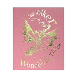
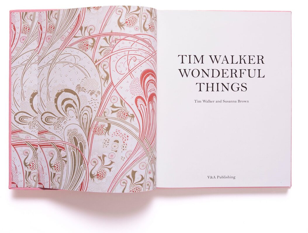
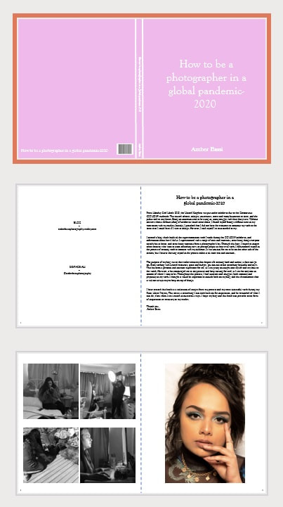
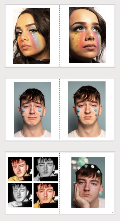
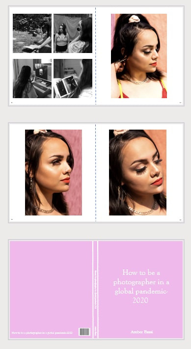
Tim Walker- Wonderful Things Walker, T. and Brown, S. (2019) Tim Walker. (1st ed.) London: Victoria & Albert Museum. Subject Matter This book is about Tim Walkers exhibition in the Victoria and Albert Museum, London. The book was created to accompany the exhibition. The intentions are to celebrate the creative work of Walker and the talents of the many he collaborated with. While it is not possible to narrow down the subject matter as one single thing, as the book includes 10 separate photoshoots, I found that the main muse seemed to be people, and the magical ways they can be photographed. Cover Design A photographic image was not used for the cover of the book, which is uncommon for a book about a photographer and his work. Most photography books have a glossy paper/card cover design which includes one of the images from the inside of the book. Instead of paper, the book is wrapped in a pink textured, cloth like material. It is then engraved on the front in gold with “Tim Walker- Wonderful Things”. In the center of the cover is a gold engraved dragon, which is linked to some of the images that Walker had created in the book. Along the spine of the book is “Tim Walker, Wonderful Things, V&A”. The back design of the book is then printed separately on its own piece of matte paper. This keeps the back design of the book plain, with the same pink cloth material. The overall design of the book does not give off the sense that it is a photography book. Instead, it seems more like a story book about fantasy and fairy tales. That style links to the themes of his work. The use of slanted text and dragon print gives a sense of surrealism and dreamlike styles. It is an interesting concept for a photographer not to display any of their work on the book, which is not often something which photographers do. However, due to the book being beautifully made and designed, it still acts as something interesting and eye catching. To someone who does not know about Tim Walker or the exhibition, the impact it gives is that the book is a story book. However, this is exactly the concept and style of his work inside. This is a clever and subtle link. On page 38, one of Tim Walkers collaborators for the “LORD OF THE FLIES” shoot, Gareth Wrighton, talks about his opinion on digital prints and physical printed pages. “Yes, looking at a beautifully produced book, it triggers a different emotional response. The medium is the message, I firmly believe in that.”- Gareth Wrighton, page 38. From this quote, I can see the influence which Walker may have taken, which encouraged him to want to create something different to a standard photography book, and something beautiful instead. Walker often discusses the emotional meaning behind his work, and where the influence came from. He talks about a distinct red colour which reminds him of his childhood, in his shoot “ILLUMINATIONS”. From the aesthetic of the outside of the book, I get taken back to my own childhood when my mom would read me pretty story books with a fairytale narrative. The book offers me some type of comfort and fantasy. The book was created to offer some type of emotional feeling to its readers/viewers. It has the intention to create real human connection. “...when you look at something digital, its cold. When I see it in print, it looks a lot better, there's a connection, a human feeling.”-Ibrahim Kamara, page 38. Strength of the photography The whole exhibition and book had a strong concept and execution. What makes the collection of images stand out is the fact that Walker created 10 photoshoots. They were all linked to fairy tales, storytelling, beauty and colour. However, they were all executed completely different. Walker created series of images for 10 different style shoots under the same category which highlights his creative intention. Walkers style of photography is very unusual and often breaks the stereotypical beauty standards. He often shoots from below his subject and captures their whole body. This angle makes his subject appear bigger, and more powerful. He also uses a fisheye style of photography which works in a wide-angle lens style which helps to capture the whole of the subject and the background/props. This fits his aesthetic of fairytale and magical creations. As he photographs his subject in an elaborate and unusual setting, he ensures the look of his subject fits the scene. Despite his work being controversial due to the nudity and clothing, Walker was able to capture his subjects in a beautiful and aesthetically sophisticated way. Having a large team of assistants, makeup artists, costume designers, set designers and many more working with him on each shoot, the images that he creates are very professional and elaborate. The budget for this exhibition would have been extremely big which allowed him and his team to create something complex but extraordinary. Page Layouts What I have noticed about the layout of the Walker’s images is that it is often inconsistent in terms of placement/sizing of images. In some of the sections, at least one image is presented on a double page spread, running across the gutter. This image seems to usually be the one larger scale image from that shoot with the most model/most props. The reason behind this larger image could be the main feature page which signifies the theme for that shoot. A double page spread is also used in the book to display two different images from the same shoot. I do not think there is any obvious and consistent correlation between the two images, other than them being from the same shoot. For example, some pages have a location image on the left and a studio on the right. Other pages may both be a location image from that shoot. Another thing worth noting is the range of borders and number of images on one single page. I found that some images have a symmetrical and even border around them, while some may only have a border to one side of the image, and some images do not have a border at all, bleeding off the page. The images from the shoot “PEN & INK” also have their own thing black border. While I originally thought that borders around the images range from shoot to shoot, I realized it ranged more between images of the same shoot. On some pages, Walker’s work is presented on a smaller scale, with more images on the page. A maximum of 4 images have been displayed together on one page. The layout of these are very symmetrical and thoughtfully placed. When I see the variety of different sized images, and which images were placed together, it helps me to envision how they would be displayed in an exhibition. As I also attended the exhibition, I know that the placement of the images was different to how the images were put together in the book. For example, an image in the book may have been put by a different image in the actual exhibition. However, looking over the book does help me imagine the sizing and placement of the images. A double spread image was often displayed by itself, on a larger scale. While the single images were often on a smaller scale, presented together. The pages with around 4 images on convey the idea that it may be displayed on a gallery wall that way also. This seems to be a conscious choice of placement. The logic behind the placement seems to simply be variety between the images from the shoot. On the pages where the images were presented, no text (other than the page numbers) can be seen. Therefore, no captions or titles of the images are directly linked. This conveys the idea of telling a story in a nonchronological order, just one image linking to the next. I love the look of the image being the only thing on the page, without any text overlapping or in the way. This gives the feel of a gallery space, as text is always displayed separately, allowing the image to have all the viewers' attention. Despite the inconsistency between sizing, borders and placement of the images, I feel as though this is very cleverly designed. The variety between the images emphasizes how modern the work is and the unusual aspect. Text In terms of text, the whole book is written in the same font. The only text included in the book are conversations between Walker and his collaborators for that specific shoot and talk about the influence behind it. This use of speaking with Walker allows the viewer to get to know who Tim Walker is, and truly understand his work and the meaning behind it. This allows us as readers and viewers to connect with the work on a deeper level. On page 14, in a conversation with Shona Heath and Susanna Brown, Walker explains how the purpose of the shoots which had been created for the exhibition and the book were done so as an effort to divulge his viewers into his “encounters with the sublime”. This was done to communicate the beauty on the look and surface of the image, and the emotional meaning hidden deeper. Edward Enninful made a comment about Tim Walker and Kate Phelan, saying “I love what you and Kate do because you don’t just shoot things on the surface, you always go a step further.”- page 68. This emphasizes the concept of the work having the intention to connect deeper with the audience. When making decisions such as which images to use, and which changes to make, Walker and his collaborators ensure to work together while also asking the models what they think, and what they like. Walker ensures that he does not take credit for the entire works and book. Instead he gives his collaborators, team and models their own recognition for their own input. This is done throughout the planning, shooting and editing process. Upon reading the conversations between the collaborators for each shoot, you are given a real insight into their influence and inspiration. This could be anything from culture, colour, fabric or narrative. While I do not think the book, exhibition nor actual images from each shoot have any type of chronological story line, I believe each image tells its own story alone, but always linking to the next image from the shoot. This is an interesting tactic for a fairytale style photobook; however, I believe it conveys the idea that photography is never ending. “...all the limitless possibilities and infinite variety.”- Tim Walker, page 70. Impact of the overall book As I have always borrowed books from the library or my tutors at college, I have never purchased my own. However, being so inspired by the exhibition I attended, I was encouraged and excited to buy the book for myself. I am often put off by buying photography books as they can be very big and hard to store. However, the aesthetic of this book makes you want to have it out on display as it is a beautiful item. The book has a lasting power as the images and the shoot are so intricately created with fine details, it leaves you wanting to look deeper. There are multiple elements to take inspiration from in Walker’s work such as use of colour, props, composition, camera angles and costume/makeup, making you want to pick up the book again. Despite being a hard back large book, I do not think that it is too big. As the images were created on such a large scale, and printed on a large scale, I believe the book is the perfect size as a representation of the exhibition. I usually dislike books which are poorly made in terms of materials as they can often be too heavy, and therefore the book cannot stand its weight and gets damaged. In terms of the content of books, I do not like photography books which display the work too small, as you miss finer details. Overall, this book is my favourite photography book that I have come across. The outside design of the book is something unusual but intriguing to not only people interested in photography. The content of the book has a great balance of text and images. As the book includes 10 different shoots, you are offered a wide variety of compositions, styles, colours, borders and locations. This constantly allows the viewer to turn the pages and see something different, but equally as extravagant. This book is the perfect memoir of the exhibition, and of Walker’s unique style. My LayoutTim Walker's book, Wonderful Things inspired me to create my own photographic book, using elements of his as influence. Before using an book making software, I opened up PowerPoint as this would allow me to quickly and easily work out my layout and order of images. I began by marking the middle of the page with a dotted like to indicate where the middle of the book would be. I then played about with fonts and found that "Goudy Old Style" looked best. To take influence from Tim Walker in my work, I made the cover of my book a gentle shade of pink. I also did not include any of my images, as this is the style which Walker uses. Upon opening the book, I created an information page with my details and text about the project in order to give the viewer an insight into what it is all about. On the next pages, I included my favourite images from my Final Major Project, as well as behind the seen shots of me. I was very happy with the look and layout of the book, and this is what I created:
FeedbackI sent a copy of the pages to my boyfriend and my class so I could get some feedback on what works well, and what needs some improvement. One comment I got was on the text section under the title. They suggested the use of different words to improve the quality of the text. Another comment I received was that the cover page may work better with an image on it. While this is not something I had wanted on my cover, I thought to test it out. I received different comments about changing up the order and layout of my images. The final comment was that my cover colour was too vibrant and may look better if it was paler or more gentle toned. Taking all of these comments into account, I made changes to my book.
I began by changing the cover, starting out with the colour of it. I wanted to keep the pink as it is my favourite colour and makes the book more personal to me. I adjusted the shade of pink so it was lighter and more gentle. However, this then made the white text less prominent. To compensate for this, I changed the colour of the text to grey in order to make it stand out from the background. As suggested, I tried adding an image to the cover of the book. I chose one of my favourite images that I have taken during my project and covered the front and back cover with it. I then changed the opacity so it was faint, and not seen at first glance. As Tim Walker's book, Wonderful Things, includes a dragon on the front which links to his research and shoots, I tried to follow that concept. I changed the zeros in the numbers 2020 to googly eyes, as I used them as props in my shoots. I also placed some silver gems by my name, which I also used as props in my shoots. These are subtle links to my work, without giving everything away. Despite it not being my plan to change the cover, I ended up preferring how it looked. I then made changes to my layout using a guide which my tutor made for me. She suggested an order/layout for my images which would allow me to spread my images our further, therefore making a bigger book. I added an extra page for where I wanted to display more images. I also added some interesting borders/background for my images to be displayed with as it gives a theme and shows the style I was going for. Along with the changes made to the text explaining the book, I also made slight adjustments with the editing of my images. Once I had made the changes, my book was complete. My completed book is on the BOOK tab.
0 Comments
|