|
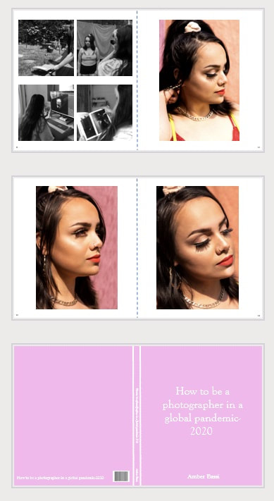
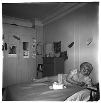
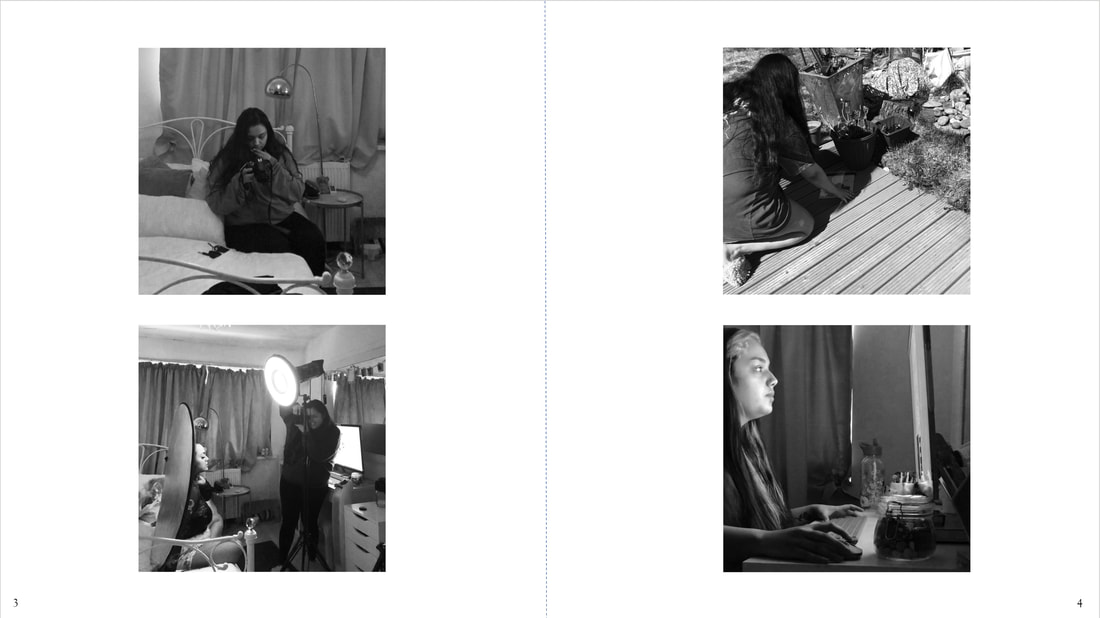
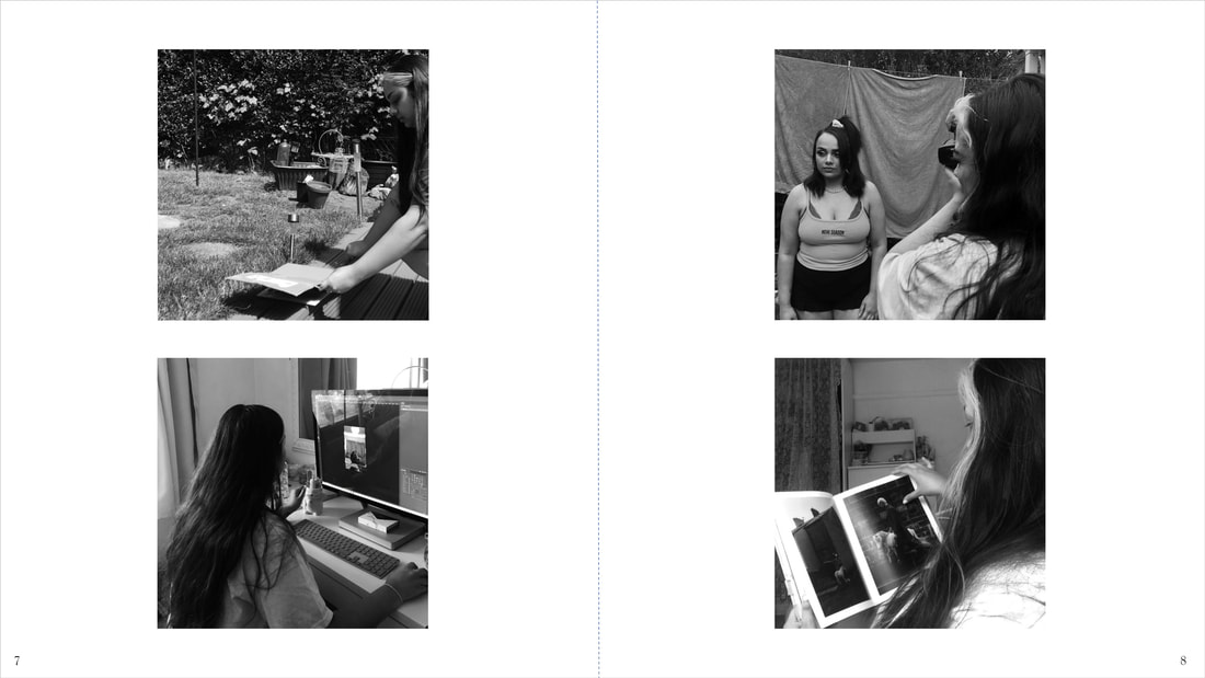
I created a blog in which I hoped other creatives would follow, which displayed my experiences through the COVID19 lockdown as a student photographer. The blog included experimentation with new techniques and using resources at home to aid in photography. The blog showed my process in creating work, and the behind the scenes shots of me in a documentary style. Using my most successful images, I then created a photography book. The book highlights the best of my work throughout this project. The book was designed to be a collection of what I have accomplished over the lockdown, hopefully inspiring others to pick up their motivation through photography.
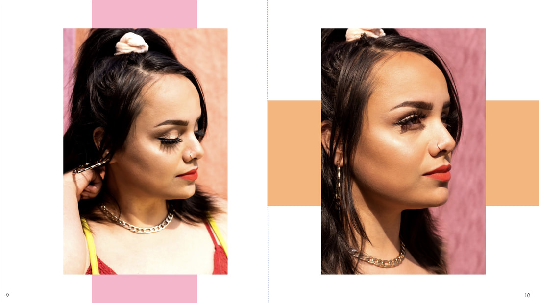
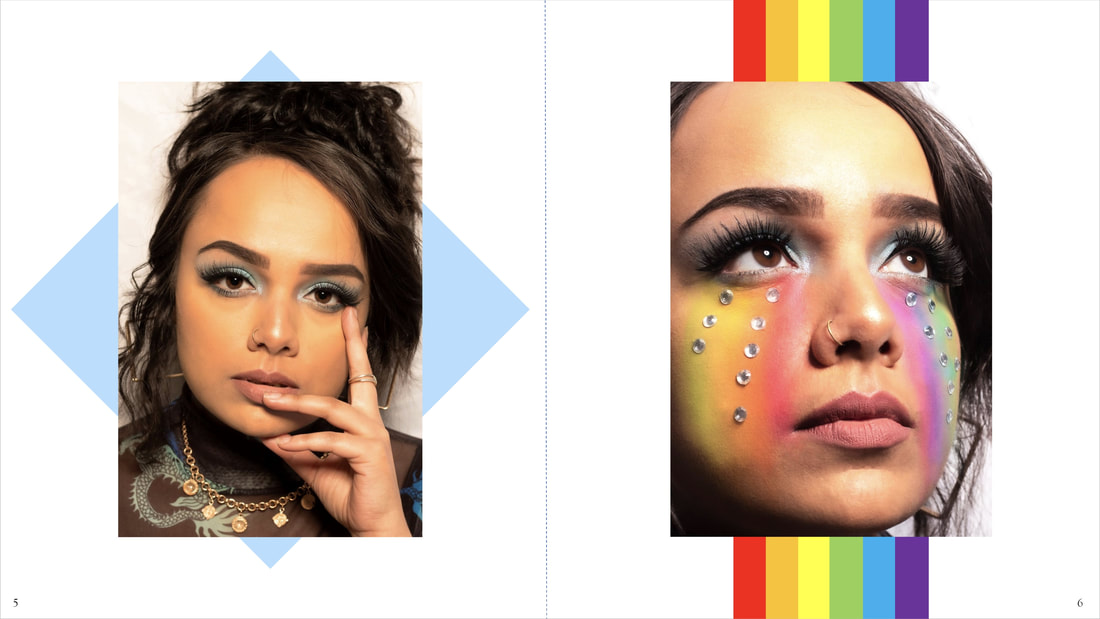
Style/Influence My style for this project was a mix of documentary photography and portrait photography. I worked using a blog post as this was something that most photographers/creative have access to view. The style for my documentary images was taking influence from an Instagram page called @lifeatsixfeet, The Six Feet Photography Project. Their online portfolio included submissions from other photographers who were photographing their experiences during the COVID19 lockdown. The page is taking submissions internationally. Their style of photography often works literally with the phrase “six feet apart” as that is roughly how far the camera seems from the subject. I took influence from this in my documentary style as when I was photographing myself in any of my processes, I would often photograph from 6 feet away. As the work comes from a range of different photographers, the styles differ between images. However, I was most influenced by the images were the subjects seem unknowingly photographed. This concept helps to keep the situation real and raw. Therefore, when I photographed myself, I would set my phone up somewhere filming me doing whatever I was at the time. I would then use the video to get a screenshot of an image. I worked this way as it allows me to work more naturally, rather than posing for an individual photograph. In terms of my portraits, I took most of my influence from Tim Walker and images on my explore page on Instagram. I wanted my images to seem glamourous and colourful, which I wanted to show through props, makeup and backgrounds. Being limited to who and what I can work with, I was not able to create as many studio shoots as I would have liked to. However, I still managed to create portraits at home using an at home studio, and webcam phone calls. I was lucky enough to get into the studio the day before the college closed, therefore I do have one studio shoot in my work. The style I tried to keep consistent between shoots was facial props (makeup, gems, pompoms etc...), highlighting a distinct colour that stands out and having a tight crop on the image. Looking over my best images which I displayed in my book, I see that I have exceeded my expectations of what I thought I could create. I believe my series flows nicely, and you can see my style represented in each image I created. Budget/Materials Due to not having resources readily available as they would be if I were at college, I was limited to what I could work with, and what I could encourage others to work with. I had a small at home studio kit to work with, which was borrowed from the college. This allowed me to set up a studio space in my bedroom and photograph my model. While not everyone has these resources to create a studio at home, most photographers do. I hoped my work would have motivated other photographers who have the resources to make the most of it and shoot from home. Materials such as acetate, gum bichromate elements and photographic paper were in limited supply while I was working with them. I eventually ran out of the acetate and gum bichromate elements, and to order them would have been a cost that I did not have the money spare for. With other responsibilities such as car insurance, road tax and rent to pay, I could not order more of these materials. This would also be the case for some of my audience. Some may be furloughed with less wages and some may have lost their job, so it was important to note that not everyone has the money available to buy extra things for their photography kit. I tried to work with materials/software that anyone could use such as Photoshop or other online editing software, as again, not everyone can afford certain things. I worked with a range of materials and techniques such as lumens, gum bichromate, studio, location portraits and webcam shoots. This was because I wanted to give the most variety to my reader to what they could try out for themselves, and what they could take influence from. I tried to be broad with what I worked with so anyone could find something which fitted their budget, materials handy and their style of art or photography. Audience As I spoke about in my project proposal, I was aiming at my audience being other creatives who work with or want to work with art or photography. I hoped that people who were viewing my blog would either learn something new which they could try at home or spark some form of creativity for them to inspire their own work. While it is difficult to tell whether people took influence from my work, or learnt something new, I do know that people enjoyed the aesthetic of my work. This is from multiple comments on specific shoots and certain images. I believe I managed to direct my work to other creatives. Strengths Throughout this project, one of my main strengths has been my research/influence sources. I found myself constantly finding new influences and styles while browsing social media. This enabled me to use a range of sources from different platforms, which gave my work the most variety and diversity. Another strength I have is my editing skills. As I now have Photoshop and Lightroom on my computer at home, I have been able to play around more and improve my confidence. This has enabled me to work more efficiently with online editing software. The last strength that I have noticed within myself over the past few months is my time keeping and organisation. I always ensured to know my deadlines, and know how much time I had for certain tasks. This allowed me to submit work on time, while also not giving myself too big of a workload. Weakness My main weakness throughout this project has been my motivation. Being in a different environment and working with limited resources caused a lack of creativity and motivation within me in my studies. I felt stuck on where to go next and what I could do. To overcome this, I was constantly researching and finding new influences that kept me excited about my own work. Timescale As mentioned in my strengths, my organisation skills and my time keeping skills kept me on top of things. In March when the college had closed, I knew how much time I had left to complete my FMP and which tasks I needed to prioritise. I completed my planner at the start of the project which was useful to look back on and see if I am on track with where I planned to be. Mostly, I was always on track with what I was planning to do. The timescale never proved an issue for me in my project as I always felt I had sufficient time to complete work to the deadline and smaller deadlines. I have submitted my work on time, to the best quality that I could have. Presentation The initial plan was to have the work displayed in a gallery at the Custard Factory in Birmingham. However, due to current circumstances, changes had to be made. This meant that students had to use online resources to display and document their work. This is a new task for me as I had always previously printed my work and had physical, paper copies of it. To present my body of work, I found it would work best to display on my blog. I already had a photography blog set up with a good format and layout. The blog allows my audience to navigate easily around my blog through different pages and posts. I have also been able to promote my blog through my Instagram, which other creatives follow. This work displayed includes my planning, experimentation, research and final outcome. It is all displayed neatly and the format is organised well. I would use blogs in the future to display work. Book The outcome of my photographic book exceeded my outcomes to what I ever thought I could create. The content of the book is filled with my process, explanation and outcomes. The creation of the book provoked an unexpected sense of pride within me that my work is book worthy, something bigger and deeper than a picture on a wall. The book perfectly represents me, my photography and what the topic is based around. Being only 14 pages long, the book perfectly sums up the highlights of my project. As this is an online book and not having the intention to print it, I did not have to consider how pages/images may distort once sewn into a spine. However, changes would need to be made if my book were to be printed, as some images would not work well, for example page 13-14. Despite this, I am very content with my book being easily accessible online. This book looks neat, professional and creative, and I am very pleased with the work I have created over the past few months. What more would I have done? Models/Studio If I were able to still be working from college, I would have liked to complete more studio shoots with a wider range of models. I would have liked to have created more male model shoots using different props and different backdrops. I would have also liked to use other female models for beauty shoots as they would all have different features such as skin texture, eyes and mouth. I would have liked to see more variety in my work in terms of who I work with. Overall, I would have liked to see more variety in the faces seen in my work as this keeps it new and interesting to look at. It would have also broadened my skills with photographing different people. However, this was not possible to do after the COVID19 lockdown. Therefore, I was only able to photograph my sister, and my boyfriend over video call. I also hoped to work with different equipment in the studio to create different looks such as harsher lighting, colour gels and new lighting attachments (octobox, snoot, honeycomb etc...). This also would have given me more variety in my work and allowed me to choose which one worked best for the look I wanted to create. At home, I have been limited to using a beauty dish, with or without the diffuser. I had hoped to deepen my knowledge in the studio through experience and experimentation. Location In previous projects, I had photographed on location which I thoroughly enjoyed. I would have liked to photograph my models on location in areas such as parks, shops etc... This would have helped me to get a better understanding of location photography in terms of appropriate equipment and settings. However, due to government guidelines stating to only leave the house for essential means, I was not able to do this. I was limited to photographing in my garden as a different setting. As the weather in the UK has been perfect for outdoor portraits, I am disappointed I have not been able to make the most of it. Film I had hoped to work with film in my FMP in order to use a range of materials, and also build my confidence in working in the darkroom, as this was one of my weaknesses on my career plan. I had hoped to work with black and white 35mm, different types of colour film and a medium format camera. However, this could not have been possible as I would not have the resources to be able to get the film developed and had prints made. To do this at home would have been very much out of my price range and there would be no space in my house. I am disappointed I was not able to work with film more in this project, but I hope to have more chances to in the future.
0 Comments
Workshop 1- Find 2 photo books and use the questions to understand and apply to your own book.
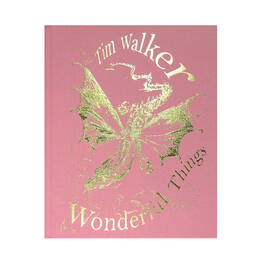
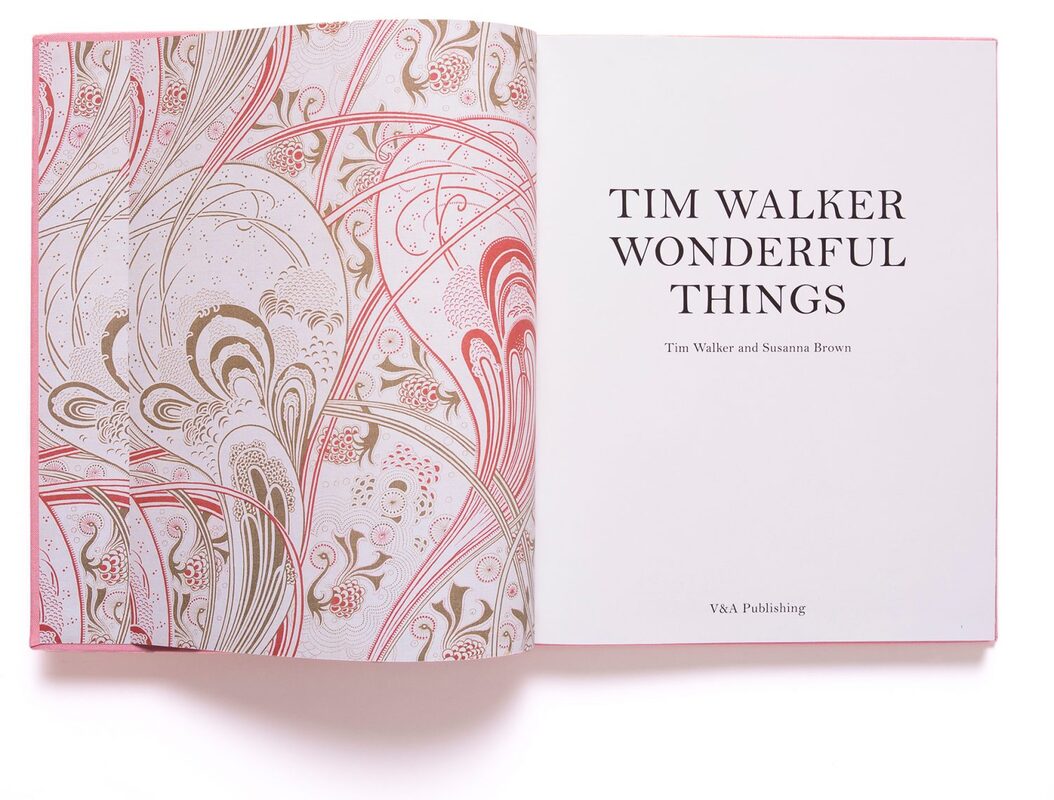
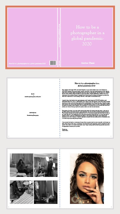
Tim Walker- Wonderful Things Walker, T. and Brown, S. (2019) Tim Walker. (1st ed.) London: Victoria & Albert Museum. Subject Matter This book is about Tim Walkers exhibition in the Victoria and Albert Museum, London. The book was created to accompany the exhibition. The intentions are to celebrate the creative work of Walker and the talents of the many he collaborated with. While it is not possible to narrow down the subject matter as one single thing, as the book includes 10 separate photoshoots, I found that the main muse seemed to be people, and the magical ways they can be photographed. Cover Design A photographic image was not used for the cover of the book, which is uncommon for a book about a photographer and his work. Most photography books have a glossy paper/card cover design which includes one of the images from the inside of the book. Instead of paper, the book is wrapped in a pink textured, cloth like material. It is then engraved on the front in gold with “Tim Walker- Wonderful Things”. In the center of the cover is a gold engraved dragon, which is linked to some of the images that Walker had created in the book. Along the spine of the book is “Tim Walker, Wonderful Things, V&A”. The back design of the book is then printed separately on its own piece of matte paper. This keeps the back design of the book plain, with the same pink cloth material. The overall design of the book does not give off the sense that it is a photography book. Instead, it seems more like a story book about fantasy and fairy tales. That style links to the themes of his work. The use of slanted text and dragon print gives a sense of surrealism and dreamlike styles. It is an interesting concept for a photographer not to display any of their work on the book, which is not often something which photographers do. However, due to the book being beautifully made and designed, it still acts as something interesting and eye catching. To someone who does not know about Tim Walker or the exhibition, the impact it gives is that the book is a story book. However, this is exactly the concept and style of his work inside. This is a clever and subtle link. On page 38, one of Tim Walkers collaborators for the “LORD OF THE FLIES” shoot, Gareth Wrighton, talks about his opinion on digital prints and physical printed pages. “Yes, looking at a beautifully produced book, it triggers a different emotional response. The medium is the message, I firmly believe in that.”- Gareth Wrighton, page 38. From this quote, I can see the influence which Walker may have taken, which encouraged him to want to create something different to a standard photography book, and something beautiful instead. Walker often discusses the emotional meaning behind his work, and where the influence came from. He talks about a distinct red colour which reminds him of his childhood, in his shoot “ILLUMINATIONS”. From the aesthetic of the outside of the book, I get taken back to my own childhood when my mom would read me pretty story books with a fairytale narrative. The book offers me some type of comfort and fantasy. The book was created to offer some type of emotional feeling to its readers/viewers. It has the intention to create real human connection. “...when you look at something digital, its cold. When I see it in print, it looks a lot better, there's a connection, a human feeling.”-Ibrahim Kamara, page 38. Strength of the photography The whole exhibition and book had a strong concept and execution. What makes the collection of images stand out is the fact that Walker created 10 photoshoots. They were all linked to fairy tales, storytelling, beauty and colour. However, they were all executed completely different. Walker created series of images for 10 different style shoots under the same category which highlights his creative intention. Walkers style of photography is very unusual and often breaks the stereotypical beauty standards. He often shoots from below his subject and captures their whole body. This angle makes his subject appear bigger, and more powerful. He also uses a fisheye style of photography which works in a wide-angle lens style which helps to capture the whole of the subject and the background/props. This fits his aesthetic of fairytale and magical creations. As he photographs his subject in an elaborate and unusual setting, he ensures the look of his subject fits the scene. Despite his work being controversial due to the nudity and clothing, Walker was able to capture his subjects in a beautiful and aesthetically sophisticated way. Having a large team of assistants, makeup artists, costume designers, set designers and many more working with him on each shoot, the images that he creates are very professional and elaborate. The budget for this exhibition would have been extremely big which allowed him and his team to create something complex but extraordinary. Page Layouts What I have noticed about the layout of the Walker’s images is that it is often inconsistent in terms of placement/sizing of images. In some of the sections, at least one image is presented on a double page spread, running across the gutter. This image seems to usually be the one larger scale image from that shoot with the most model/most props. The reason behind this larger image could be the main feature page which signifies the theme for that shoot. A double page spread is also used in the book to display two different images from the same shoot. I do not think there is any obvious and consistent correlation between the two images, other than them being from the same shoot. For example, some pages have a location image on the left and a studio on the right. Other pages may both be a location image from that shoot. Another thing worth noting is the range of borders and number of images on one single page. I found that some images have a symmetrical and even border around them, while some may only have a border to one side of the image, and some images do not have a border at all, bleeding off the page. The images from the shoot “PEN & INK” also have their own thing black border. While I originally thought that borders around the images range from shoot to shoot, I realized it ranged more between images of the same shoot. On some pages, Walker’s work is presented on a smaller scale, with more images on the page. A maximum of 4 images have been displayed together on one page. The layout of these are very symmetrical and thoughtfully placed. When I see the variety of different sized images, and which images were placed together, it helps me to envision how they would be displayed in an exhibition. As I also attended the exhibition, I know that the placement of the images was different to how the images were put together in the book. For example, an image in the book may have been put by a different image in the actual exhibition. However, looking over the book does help me imagine the sizing and placement of the images. A double spread image was often displayed by itself, on a larger scale. While the single images were often on a smaller scale, presented together. The pages with around 4 images on convey the idea that it may be displayed on a gallery wall that way also. This seems to be a conscious choice of placement. The logic behind the placement seems to simply be variety between the images from the shoot. On the pages where the images were presented, no text (other than the page numbers) can be seen. Therefore, no captions or titles of the images are directly linked. This conveys the idea of telling a story in a nonchronological order, just one image linking to the next. I love the look of the image being the only thing on the page, without any text overlapping or in the way. This gives the feel of a gallery space, as text is always displayed separately, allowing the image to have all the viewers' attention. Despite the inconsistency between sizing, borders and placement of the images, I feel as though this is very cleverly designed. The variety between the images emphasizes how modern the work is and the unusual aspect. Text In terms of text, the whole book is written in the same font. The only text included in the book are conversations between Walker and his collaborators for that specific shoot and talk about the influence behind it. This use of speaking with Walker allows the viewer to get to know who Tim Walker is, and truly understand his work and the meaning behind it. This allows us as readers and viewers to connect with the work on a deeper level. On page 14, in a conversation with Shona Heath and Susanna Brown, Walker explains how the purpose of the shoots which had been created for the exhibition and the book were done so as an effort to divulge his viewers into his “encounters with the sublime”. This was done to communicate the beauty on the look and surface of the image, and the emotional meaning hidden deeper. Edward Enninful made a comment about Tim Walker and Kate Phelan, saying “I love what you and Kate do because you don’t just shoot things on the surface, you always go a step further.”- page 68. This emphasizes the concept of the work having the intention to connect deeper with the audience. When making decisions such as which images to use, and which changes to make, Walker and his collaborators ensure to work together while also asking the models what they think, and what they like. Walker ensures that he does not take credit for the entire works and book. Instead he gives his collaborators, team and models their own recognition for their own input. This is done throughout the planning, shooting and editing process. Upon reading the conversations between the collaborators for each shoot, you are given a real insight into their influence and inspiration. This could be anything from culture, colour, fabric or narrative. While I do not think the book, exhibition nor actual images from each shoot have any type of chronological story line, I believe each image tells its own story alone, but always linking to the next image from the shoot. This is an interesting tactic for a fairytale style photobook; however, I believe it conveys the idea that photography is never ending. “...all the limitless possibilities and infinite variety.”- Tim Walker, page 70. Impact of the overall book As I have always borrowed books from the library or my tutors at college, I have never purchased my own. However, being so inspired by the exhibition I attended, I was encouraged and excited to buy the book for myself. I am often put off by buying photography books as they can be very big and hard to store. However, the aesthetic of this book makes you want to have it out on display as it is a beautiful item. The book has a lasting power as the images and the shoot are so intricately created with fine details, it leaves you wanting to look deeper. There are multiple elements to take inspiration from in Walker’s work such as use of colour, props, composition, camera angles and costume/makeup, making you want to pick up the book again. Despite being a hard back large book, I do not think that it is too big. As the images were created on such a large scale, and printed on a large scale, I believe the book is the perfect size as a representation of the exhibition. I usually dislike books which are poorly made in terms of materials as they can often be too heavy, and therefore the book cannot stand its weight and gets damaged. In terms of the content of books, I do not like photography books which display the work too small, as you miss finer details. Overall, this book is my favourite photography book that I have come across. The outside design of the book is something unusual but intriguing to not only people interested in photography. The content of the book has a great balance of text and images. As the book includes 10 different shoots, you are offered a wide variety of compositions, styles, colours, borders and locations. This constantly allows the viewer to turn the pages and see something different, but equally as extravagant. This book is the perfect memoir of the exhibition, and of Walker’s unique style. My LayoutTim Walker's book, Wonderful Things inspired me to create my own photographic book, using elements of his as influence. Before using an book making software, I opened up PowerPoint as this would allow me to quickly and easily work out my layout and order of images. I began by marking the middle of the page with a dotted like to indicate where the middle of the book would be. I then played about with fonts and found that "Goudy Old Style" looked best. To take influence from Tim Walker in my work, I made the cover of my book a gentle shade of pink. I also did not include any of my images, as this is the style which Walker uses. Upon opening the book, I created an information page with my details and text about the project in order to give the viewer an insight into what it is all about. On the next pages, I included my favourite images from my Final Major Project, as well as behind the seen shots of me. I was very happy with the look and layout of the book, and this is what I created:
FeedbackI sent a copy of the pages to my boyfriend and my class so I could get some feedback on what works well, and what needs some improvement. One comment I got was on the text section under the title. They suggested the use of different words to improve the quality of the text. Another comment I received was that the cover page may work better with an image on it. While this is not something I had wanted on my cover, I thought to test it out. I received different comments about changing up the order and layout of my images. The final comment was that my cover colour was too vibrant and may look better if it was paler or more gentle toned. Taking all of these comments into account, I made changes to my book.
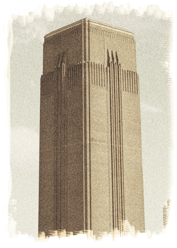
I began by changing the cover, starting out with the colour of it. I wanted to keep the pink as it is my favourite colour and makes the book more personal to me. I adjusted the shade of pink so it was lighter and more gentle. However, this then made the white text less prominent. To compensate for this, I changed the colour of the text to grey in order to make it stand out from the background. As suggested, I tried adding an image to the cover of the book. I chose one of my favourite images that I have taken during my project and covered the front and back cover with it. I then changed the opacity so it was faint, and not seen at first glance. As Tim Walker's book, Wonderful Things, includes a dragon on the front which links to his research and shoots, I tried to follow that concept. I changed the zeros in the numbers 2020 to googly eyes, as I used them as props in my shoots. I also placed some silver gems by my name, which I also used as props in my shoots. These are subtle links to my work, without giving everything away. Despite it not being my plan to change the cover, I ended up preferring how it looked. I then made changes to my layout using a guide which my tutor made for me. She suggested an order/layout for my images which would allow me to spread my images our further, therefore making a bigger book. I added an extra page for where I wanted to display more images. I also added some interesting borders/background for my images to be displayed with as it gives a theme and shows the style I was going for. Along with the changes made to the text explaining the book, I also made slight adjustments with the editing of my images. Once I had made the changes, my book was complete. My completed book is on the BOOK tab. Determined not to give up on creating a successful gum bichromate print, I began researching ways to create a digital version instead. I did this for two reasons; 1. I did not have the resources to create another physical print after my first unsuccessful test. 2. Others who may want to create their own gum bichromate may not have the resources or know how to. Upon searching for an online tutorial on how to create a digital version on both Youtube and Google, I realised it may be harder than I initially realised. Everywhere I looked, I was just finding tutorials on how to create the physical print, rather than an online edit. When looking at my previous work from years ago, I found that I had made an digital edit of the gum, but I used a pre-set provided by my tutor. Therefore, I began searching for pre-sets online, which also proved very difficult. Often you would have to pay, create an account, or have branding over your image, which I did not want to do any of this. Instead, I tested my Photoshop knowledge to create my own process of a gum bichromate edit. As a reference image, I chose this image which I feel best represented a successful gum print. This is due to the authentic paint brush strokes around the borders of the image, the subtle glow/haze, and the sepia, desaturated tone. 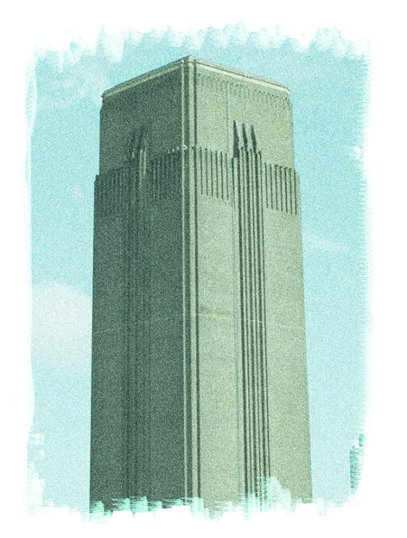 I began by opening the original image that I used for my physical version on Photoshop, and duplicating the layer so I still have the original photo underneath my edits. I then adjusted the curves of the image to fix the exposure of the image, bringing back in some shadows and clouds. I then went into adjustments>photo filter, and selected sepia. I then went back into my curves and adjusted them again to maintain good exposure and detail. I then went into filter>noise>add noise, where this added some grain and haze to the image. I was able to adjust the amount to what worked best. I then went back into filter and selected stylize>diffuse. This gave me the option to haze and fade out my image further. I was able to select which mode worked best for my image which seemed to be Lighten Only. Going back into my curves again, I ensured details of my image were still visible. As I wanted to create paint brush style strokes around the border of the image to make it look more realistic as a gum bichromate print, I then moved onto that. This step was very simple but made all the difference. I selected the paint brush tool with white and chose the brush style in smoothing of 174. This was the most authentic looking paint brush tool. I then used a 100% opacity to erase the edges of the image. Lowering the opacity to 50%, I then blended out the harsh lines to make it appear more realistic. After one last adjustment to my curves, my edit was complete. The process took me around 15 minutes to get my head around. Here is the end result:
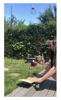
Gum Bichromate was a process introduced in the 19th century, which was often used in the Pictorialism era. While it is not a common practise in modern day, some photographers still experiment with it, and create work. Following a video tutorial created by my tutor, I edited an image which I would use for my gum bichromate. I chose to use an image of a building I captured in London 2018. I chose this image as opposed to a portrait which I commonly use because I wanted an image which tiny fine details, lots of depth and a high contrast. This is more likely to be seen in a landscape image. The image I used had texture from bricks, details from the sky and a range of tones. This will look better on a gum bichromate as it emphasises the details and dimension. The tutorial on editing allowed me to adjust settings such as clarity, highlights, shadows and contrast. I was aiming for my image to appear deeper in tone. I did these adjustments in Lightroom. I then opened the edited image in photoshop to adjust the curves and levels to further bring out the darkest blacks and bright forward the lightest whites. By using Ctrl I, my image was inverted. I then went back to adjusting the levels and curves to bring out a high contrast. After a small crop to a 8:10 size, I sent my image to print. This is the negative I will use for my gum bichromate: 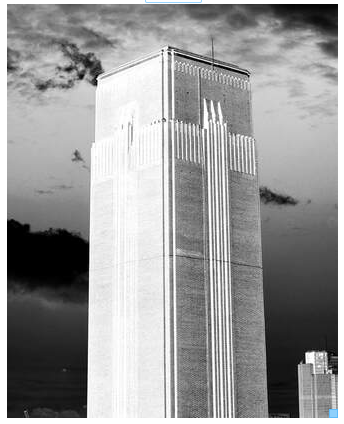 After battling with my printer for an hour, I printed the image onto acetate. The first acetate was very stripy due to issues with my printer and my second acetate was still stripy but improving. After adjusting more settings and cleaning the ink on my printer, I finally printed a good quality acetate image. However, with some lines from the printer viable. I then left the ink on the acetate to dry on a flat surface so the ink would not drip and it would stay even. My next step was to prepare my gum bichromate mixture. My tutor sent me a step by step guide to creating the mixture, painting the image and testing the exposure which I followed. Firstly I measured out my correct ingredients to mix together, and prepped my paper, following these steps: - 1 heaped tablespoon of dichromate mixed with 80ml of hot water - 5ml of gum mixed with peasize ball of paint - add 5ml of dichromate solution to gum and mix - paint paper with even strokes, going in both directions (I left a white messy boarder around the edges to add an interesting looking texture, and a "painted on" look to the gum bichromate) - let paper dry (around 20 minutes in dark) I checked my paper after about 20 minutes, and when it was dry, I placed my acetate over the paper and secure it in place with a clipboard. I took the clipboard and a piece of cardboard outside to expose my image. As it was a sunny day, I thought that this would be perfect for the experiment.
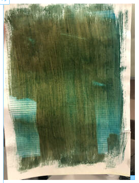
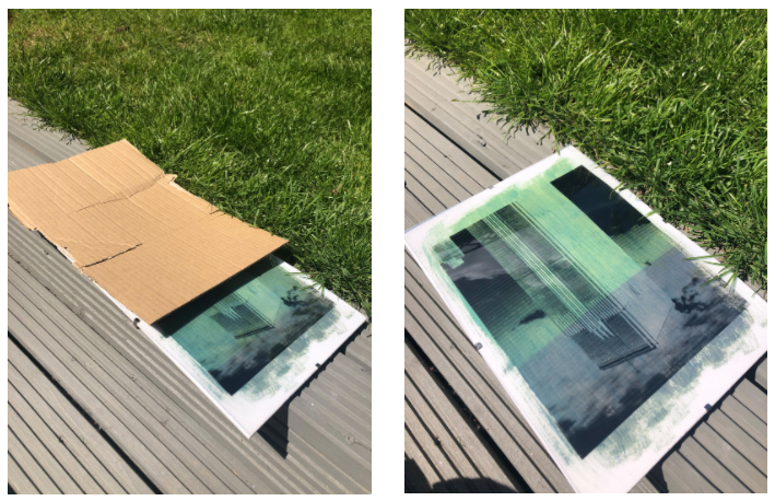 After the last time interval to expose the last section of the image, I took my print inside and took the paper out of the clipboard. The end result was very dark with unclear details. I washed the print under warm water to remove excess chemicals. This washed off in a yellow colour. Once the water was running clear, and the image did not have a slimy feel to it, the chemicals has washed away. The print then needed to be left to dry.
I found the process of creating a gum bichromate quite difficult and fiddly to do. I do not have very much experience with this. I had the resources/materials available for one gum bichromate image. However, I do not think I will order more to create another print due to budget and preference. While I agree that the end results can be beautiful, I do not think I would use this process again. This is because I do not think it is easy to achieve at home (personally), I found it hard to control, and I would have probably preferred a digital version to make it. However, I know where I went wrong with this experiment, so in future if I ever want to create another gum bichromate, I know how to do it correctly.
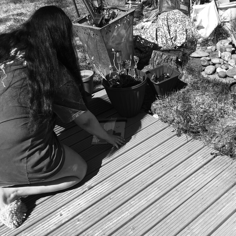
Despite my experiences and opinions, I would encourage other to create a gum bichromate print if they have the materials as it was exciting to see what would turn out on the paper, and it was something different to what I usually do SpotlightAs I have mentioned previously, due to the circumstances of being in lockdown, I am very limited to what I can use to photograph and what I can actually photograph. I have been seeing lot of DIY photoshoot hacks on social media where people are using difference/unusual resources to mimic a certain style. One example which intrigued me what using an empty toilet roll to create a snoot light/spotlight look. The way it works is you tape an empty toilet roll over the flash of your phone, or a torch which will then create a strong beam of light in the shape of a circle. As I am not able to use models during lockdown, I tried to photograph myself. I propped my phone up with the torch on in front of me with my camera on a tripod a little to the left. I had the camera quite close to me so i could still press the shutter release button. Due to it being quite dark as my phone was the main light source, my camera struggled to focus. I also found this very difficult as I could not see what I was photographing. After editing, I have a couple images which I like, and I find interesting. I intentionally over cropped the images as I preferred that look to them. 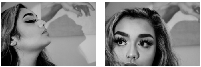 I love the dramatic/Hollywood style look that this lighting creates, and it was very easy to set up the lighting. However, as most people would say, I do not like photographing myself. Despite this, it was a fun tool to play around with. The images remind me of a Cindy Sherman style self-portrait. I am also inspired by the silhouette style that is seen in the shadows and I may use this lighting set up again to take silhouette images. 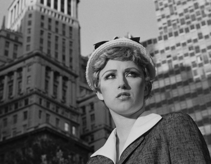 (Untitled Film Still #21 by Cindy Sherman, 1978. Courtesy of the artist and Metro Pictures, New York) In the behind the scenes images I took to highlight how to be a student photographer in lockdown, you can see me setting up a lumens in my garden. I chose to try creating a lumen so I could experiment with more materials which I can easily do from home. I used a leaf, some small butterfly charms and a strip of negatives. Plants are commonly used in lumens as they react with the chemicals to give more interesting colours and variations. I then also used negatives as I wanted to see how clearly it projected what was on the negative onto the paper. I thought that a lumen could be interesting to use as a border around my final images as a symbol of what I did during lockdown, and how I stayed creative. I placed my items on the photographic paper and attached a clipboard to keep everything in place. I then left this in the sun in my garden for around 4 hours. After around 4 hours, I took the clipboard back inside and removed the items to reveal my lumen. The main part of the lumen is the big leaf in the centre. The leaf created deep red/orange colour. The smaller butterflies came out pink/purple/blue. This colour variation made the lumen much more interesting to look at. At the top of the paper is where I placed my film strip. I think this would have needed more time as it came out very faint. However, looking closer at it, you can slightly see what the image was meant to be, which I find really interesting. As I do not have access to fixer, I have placed my lumen in a dark area so that the image doesn't change too drastically. 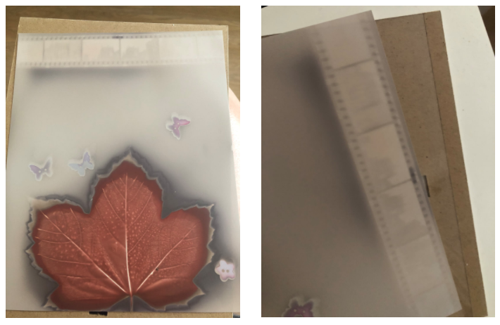 As my first shoot was not as successful as I had hoped, I attempted the same shoot again. The difference this time was that there was more natural light available which I thought could improve the quality of the image. I was shooting during golden hour, so the sun was providing very bright light in my subjects room. I had him positioned directly in front of the light in order to get a better exposed image. As the light source which was directly in his room was not very big, I chose to just shoot images of my models face, instead of getting him to pose. This would enable me to make the most of the light available. To take these images, I used my phone camera as I was quickly able to take images during golden hour, instead of having to set up my camera and potentially missing the light. When I was shooting the images, it became evident that the issue was still the connection in the call which was causing the image to become pixelated and blurry. This made the image very bad quality, and not useable for my final piece which I was disappointed about. I have edited some of the images to try and improve the look of them. To edit the images, I opened them on photoshop and cropped them all to be square. I then added a camera raw filter where I was able to reduce the texture and increase the clarity. I then added a levels filter where I adjusted the brightness and contrast in order to give the images more depth and dimension. As you can see, there is a shadow covering part of the image which I found to be a distraction, but it was too large to erase. 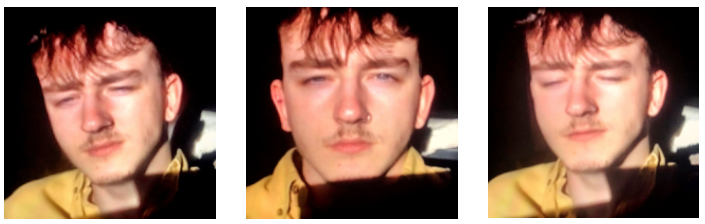 As the images give of a very serious, pokerfaced style, I thought they may look better in black and white. After giving the images a genetic edit to improve the quality and brightness of them, I added a black and white filter to them where I adjusted the red and yellow. The images initially looked a bit flat, adjusting the colours allowed me to bring back the shadows and smaller details. I will ask my peers if they think the images look better in black and white as I may try this style again. 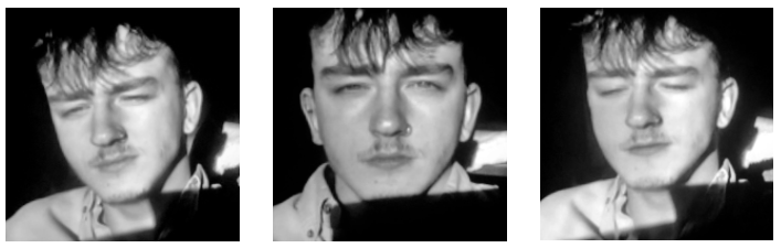 Despite the shoot not going to plan, this gave me the idea to try working differently. As I was editing webcam images to try and improve the quality, I found that this did not really work. I then thought that instead, I could get my model to take their own pictures (with directions from me), and then I edit them in a way which slightly increases the grain and pixilation, to look like it was taken during a video call. Therefore, I would have a better quality image, which still looks like it could have been taken during a video call. This still fits into the concept of adapting in order to still work with a model to do a shoot.
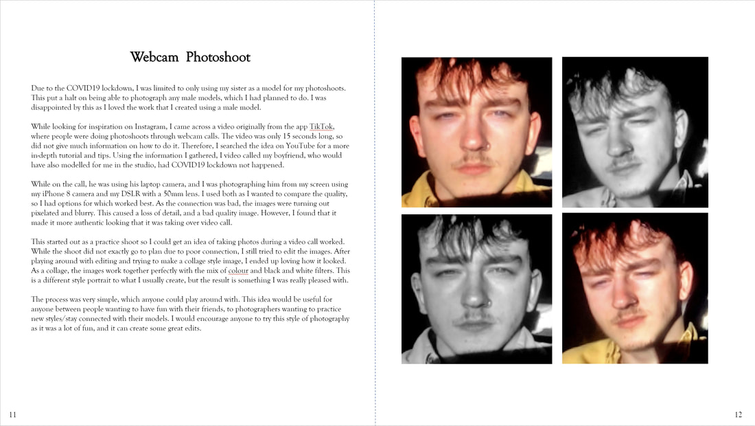
A struggle of being a student photographer in isolation is the fact that you are extremely limited to what you can photograph and who you can work with. As the majority of my project is based around portraiture, I knew that this would be a problem for me. To try to resolve the issue, I have tried photographing myself, and photographing my sister who I live with. While both outcomes were successful, I still wanted to experiment further. I wanted to try working with a male subject again. The only man I live with is my dad, and he did not want to be photographed. However, as my friends know I study photography, many of them sent me short videos created on Instagram/TikTok of people doing a photoshoot through FaceTime. As the issue of not having models is not just affecting me, many other photographers have shown themselves video calling their models and photographing what they see on their screens. I loved this idea straight away, as it suits the concept of creating something new and working differently despite the bad situations. I also thought that this would be a fun thing to try. To do more research on how to efficiently take pictures like these, I watched a few YouTube videos showing photographers video calling their models. The photographers explained what they were doing and showed the process of it. Watching the videos helped to give me inspiration of poses and how I should take the pictures. However, due to this being a fairly new concept, there were not many videos or much explanation about how to photograph a male model. I thought the best way for me to learn was by testing the idea out. These are the videos which I watched for inspiration: https://www.youtube.com/watch?v=hWqu3lniDG8 https://www.youtube.com/watch?v=KhiGR5Pc16A I video called my boyfriend who has previously been a model for me in this project. He was using the webcam on his laptop. To take the pictures, I used both my phone camera and my DSLR to see which worked better. I used my phone camera so I could very quickly take pictures. I then also used my DSLR to see if it improved the quality of the image, which did not seem to make much difference. As the internet connection was bad, the image which I could see of him on my screen was very bad quality and pixelated. However, I carried on shooting and I tried to work with the resources I have. 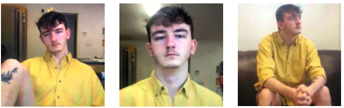 I found this shoot very difficult to do for the following reasons. I could not control the lighting we were working with like I usually can. It was a sunny day so we tried to make the most out of the natural light. It was also difficult to communicate due to the connection being poor. I found it hard to direct him to certain poses and moving the camera a certain way. The background was also an issue, as he is living in student accommodation, there are not many places in which the background would be suitable for a portrait. I tried to just focus on photographing poses and angles which worked best.
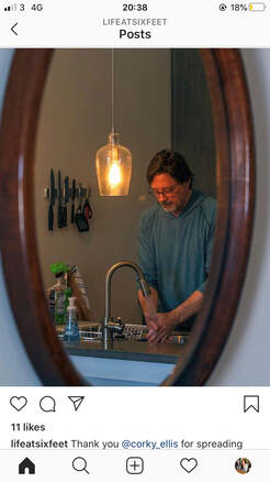
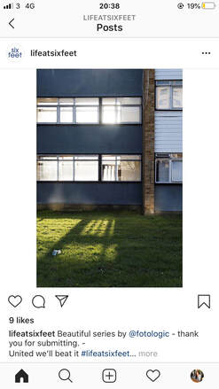
Using the images I took, I uploaded them to Photoshop and cropped them all the same size. I found a square crop worked best. I then tried to adjust the contrast and exposure to give the illusion of better quality images. I increased the saturation as they looked too flat, without any dimension. I also tried to reduce the grain/noise of the image. It is clear the end result images were taken from a webcam as they have that look to them. However, I do not think they look too bad. I have a lot of fun doing this shoot, and it was also quite funny to do. I will try shooting with him again in different lighting and different areas of where he lives to see if it improves the look of the images An app which inspired me for my next idea is the app "1 second of the day". I have been using this app for over a year now where I record one second of every day and each second then collages together into a video. This app inpsired me to cherish every day and carry on making amazing memories. To link this idea with photography, I chose to try taking a photo of every day. To give a theme to this, I decided to go down the route of self portraiture. As the one second of the day app helped me find something good in each day, and enabled me to document my life and what I do daily. Daily, I had planned to take pictures of myself before doing something, and then after doing something, to see visually what changed, and how long it took me. I will do this with activities such as makeup, skincare, showering, workouts and sleeping. This is a sort of experimentation where I will be able to see how much time I spend on myself daily/weekly, and what difference it makes to me. When discussing this with my class, everyone thought that this was a good idea so I planned to go ahead with it. However, when I thought about it more outside of class, this is something personal to document, that others may not pay much interest in. If I am generating ideas that would be displayed in an exhibition/gallery, I need to create something interesting and exciting, and I am just not sure this idea is. When talking to my peers about the concept of portraiture that my whole project is based off, I expressed how I would struggle to get models for my ideas and some ideas were going to be hard to follow through with due to the Coronavirus. One of my peers suggested that I still follow through with my idea of photographing daily, but include the current topic of COVID19. Instagram is currently a massive platform that photographers are using to document the current issues in the world, and create a community for others to get involved in. As no one is able to go out and find a variety of things to shoot, or find models to shoot with, many pages are inviting others to create a collaborate project with multiple submissions. I love this concept as it helps to give people something exciting to do during this difficult time. It also creates a warm community, reminding people we are all in this together. Six Feet Photography Project One page called Six Feet Photography Project (@lifeatsixfeet), invites photographers to document their daily lives during this time of social distancing. This is page which is inviting people all over the globe to take part. The intention of this group is to investigate what the meaning of distance is. Six Feet strive at encouraging photographers to connect deeper with their daily lives through the tool of a camera and community. Six Feet is currently a very small page on Instagram, but the more people that get involved, the bigger portfolio they have. I am very intrigued with this project and I am passionate about taking part. What is interesting about the work they have published so far is that alone, the images are very simple, without much going on. So without knowing the context, there is not a lot to look at in the images. However, when knowing the context of social distancing due to the COVID19 pandemic, it causes you to look much deeper into the images. For example, in the image on the left, you simply see a shadow being casted by light through a building onto grass. The building and surrounding area seems very quiet and isolated. However, knowing the current situation, I can imagine the same image with children playing on the grass in the sun. I can picture how the image may have looked when life was normal. This image helps to express the isolation in the world. As the image is taken from a distance, this also helps to emphasise the concept of social distancing, looking from a far. The image on the right is in contrast to the one on the life. The left is an outsiders point of view, while the right is an insiders point of view. Again, without knowing the background, this is simply an image of a man washing his hands through a reflection in a mirror. When knowing the context, advice given is to wash your hands often for 20 seconds to prevent the spread of Coronavirus. Therefore, many celebrities have been taking part in challenges where they show themselves washing their hands for 20 seconds. In this image, I can imagine this man is washing his hands to stay healthy during this time. This shows evidence of people doing their part to contain the spread of COVID19.
Materials I am interested in taking part in this project to help build a community. I will also try photographing my own daily life during this pandemic, including any social distancing, washing my hands and keeping updated with government advice. Individually, these images may not be very interesting but as a series, they will tell a story and provoke emotions. I will shoot on my phone camera as this keeps to my everyday life and I will be able to photograph often and quickly. I will also try different editing apps to create a memory style image by adding haze and grain. This helps to signify that we are moving forward, gradually in the right direction, and soon, these images will all just be a memory. Diane ArbusDiane Arbus was an American photographer who documented people through portraits. Her subjects were often on the outskirts of society, which gave her work much variety. From circus performers, to the mentally ill, to transgender people, the work consisted of documenting people who may not "fit in" to society. Through her documentary work, she questions the subject of identity. Often quite controversial, her work is recognised by intimate, black and white portraits. Arbus began her documentary photography in 1950's where she would explore the streets of New York, using the people she came across as a way of representing it. I see the struggle that she dealt with her mental health through her photography. By photographing and documenting others who struggle to be accepted by society, I see Arbus using this as a way to relate to others. In 1971, Arbus committed suicide. Arbus' work is inspiring as she made people who may not feel accepted in their daily lives, be a part of something different and something new, encouraging them to be happy in who they are/want to be. This is something I would like to take and use in my own work. Due to COVID19, many people are at home feeling unmotivated and alone. By documenting my ways of staying busy and keeping creative, I hope to inspire others to do the same and feel part of a community. I plan to experiment editing my images of documentary in black and white to work in the same aesthetic style as Arbus, and give the work a past feel. Testing To first explore the idea of shooting how COVID19 affects my daily life as a student photographer, I began research by going about my daily routine and documenting it, without the affects of COVID19. I did this by taking a photo from my point of view every time I did something which I do daily. This included simple things like waking up, opening my curtains, making my bed, brushing my teeth etc... As you can see, the images alone are not very interesting. This is because I feel as though they do not have meaning to them. As I mentioned before, I did not want to document my daily life as this would be boring for others to see. I took these photographs using my phone camera.
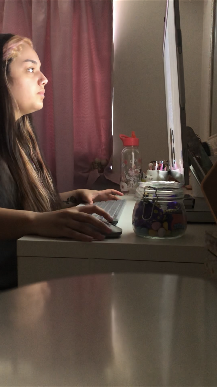
However, it was important for me to document what I do, so I know what is different now. Comparing my routine to what it was, to how it is now, there are major differences. One major difference being how I continue being a student, working on my project, but being limited to being at home. I initially felt very disheartened about continuing my project to my full potential. However, the concept of documenting how to continue what I would do at college, but at home instead has inspired me to try new methods and play with new materials. Therefore, I began documenting how I continue being a student, and trying to push myself further with a new way of working. To do this, I started photographing myself from a different point of view. Instead of photographing my point of view, and how I see things, I started photographing myself further away, so I could see how other see me. I wanted to do this so it fits in with the concept of the Six Feet Photography Project. But also, to show evidence of me really trying new things and working differently. I hoped that this would inspire others to stay motivated in their university work/job work by seeing me work, despite the situation. Again, I used my phone camera to take these images as I was occasionally using my DSLR in the image. I tried to photograph myself on different days, showing me doing different tasks as I wanted to show that this is an ongoing situation at the moment, and I am constantly adapting. I intended for the images to be from an outsiders point of view, so I set my camera up a few metres/feet away from me.
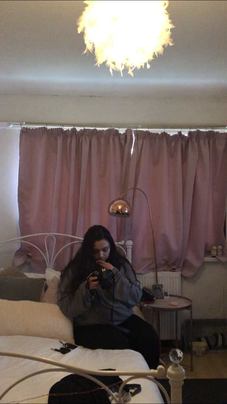
Photographing myself like this/having my photo taken like this did make me very uncomfortable. In the images, you can see I am in lounge clothes with no makeup on, as I was constantly in the house. I did not want to put makeup on/dress like I was going out as I wanted to keep the concept of this shoot real and raw, emphasising how I am working from home. A lot of the time, I had to prop my phone camera up somewhere and record myself for a couple of minutes and screenshot the clearest moment. I did this so it looked as least staged as possible. Although the background in my images is often messy, I wanted to show the reality of working in a different environment. Despite the images being unflattering and bad quality, they provoke certain emotions for me about isolation. Looking at the images makes me proud I have been able to adapt with new ways of working, and most of it being independently. However, it also makes me a bit upset to think about how different my life is, and to actually see me living differently. Testing EditingAs I mentioned in my Diane Arbus research, I wanted to test editing my images in black and white to give them a documentary style. This also allows me to work closer in the style of Arbus. 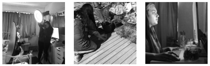 To convert the images to black and white, I used the camera raw filter and made slight adjustments to the colours. I then opened the image onto Photoshop and made necessary adjustments in the curves. Due to the images being taken on my phone, I did lose some quality while editing which made them more pixelated and grainy. However, this made the images look better as it gives a more authentic feel that they were taken in the past.
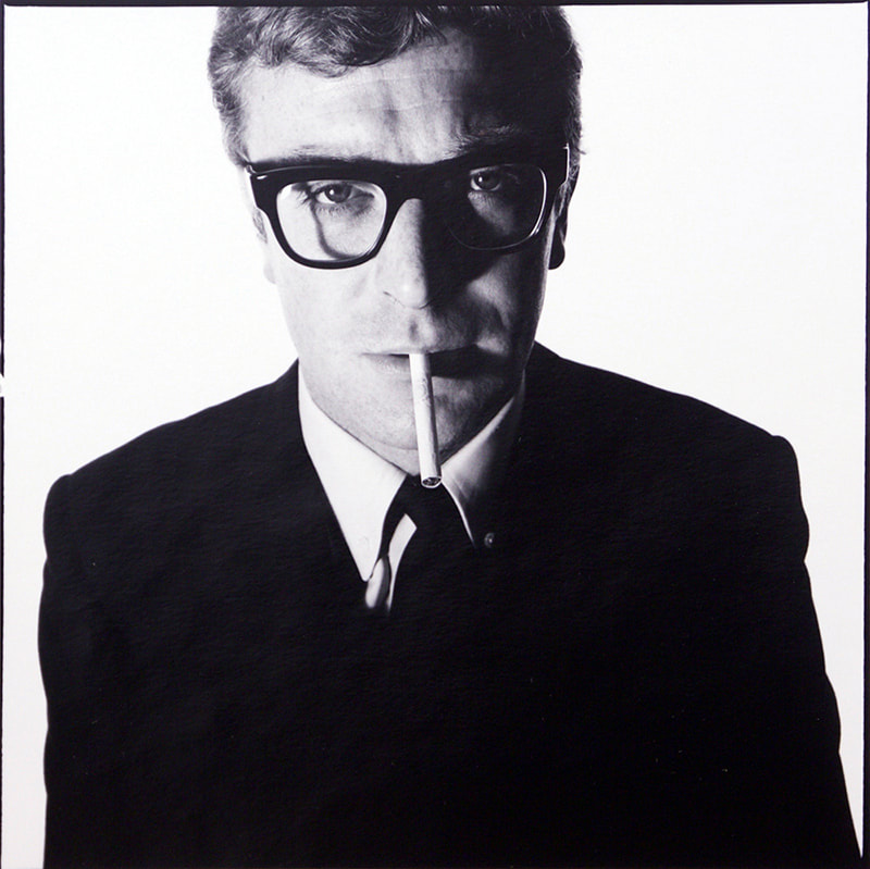
Commonly in photography I have noticed the styles of which female and male models are photographed, and the differences between them. Female portraiture beauty shots can range from being very clean, natural and fresh looking with the use of soft lighting, minimal shadows and retouching, to being high fashion and extravagant with the aid of props, bright lighting and unusual makeup (which I will be exploring in Idea number 2). However, I have noticed that male portraiture beauty style shots are typically very similar. Some characteristics I have noticed are black and white filters, high contrast and very serious facial expression. This is often to show masculinity and manly features of the model which is often seen as most attractive. I feel as though you do not see gentle portraits of males which are more lighthearted, happy and fun, as you do with females. Therefore, I wanted to create my own. I will be creating both playful, soft and funny portraits, as well as the typical serious, poker face portraits. I will compare both to see if one makes a man more attractive than the other. David Bailey David Bailey is widely known as being one of the greatest living portrait photographers. His distinct style includes close cropping, white backgrounds and high contrast. Bailey would often be equally as famous as the subject he was shooting. Often creating controversial work with certain people, Bailey is still highly influential to many artists and photographers.
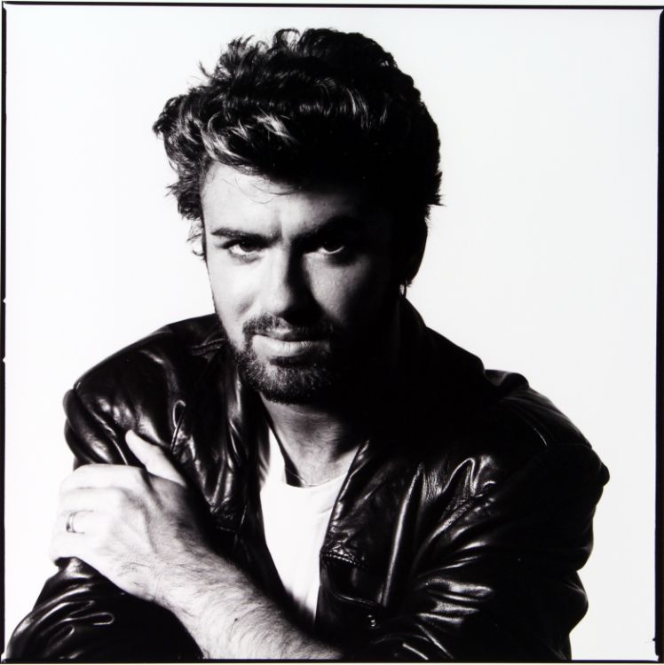
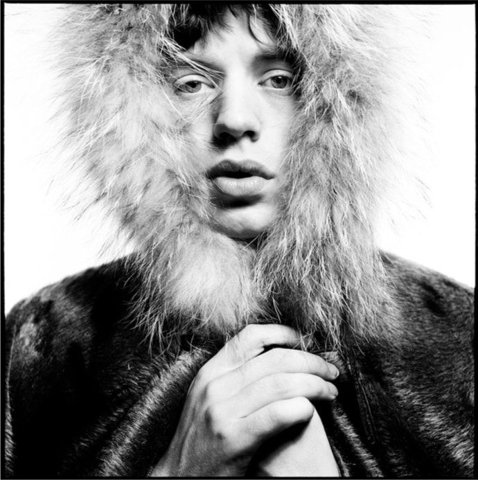
As you can see, his work has an easily recognizable appeal to it. He creates character portraits which using clothing and pose, you get an insight into the personality of the model, and what they are known for. Bailey was my first inspiration for my idea as his work has a way of being something you'll always remember. One of my favourite things about Baileys work is his” up close and personal” crop. This allows the viewer/audience to see every detail about the subject and get a better understanding of who they are. This tight crop allows us to be closer to the model and see things that you maybe haven't noticed before. Thinking about it, a tight crop can sometimes be a little too close and personal with the subject and can give of a sense of discomfort. However, Baileys subjects always seem confident, powerful and relaxed. This would most likely be a result of a good model to photographer relationship. I find that occasionally a tightly cropped portrait can be unflattering to the subject as you get a better look at fine lines, imperfections and scars. However, Baileys work is evidence that they are not always unflattering if they are photographed right. I would like to make my own images this tightly cropped to show the finer facial details and make them beautiful. Another distinct characteristic of Baileys work is his use of lighting with black and white film. Baileys models are often very high contrast with bright lighting and harsh shadows on the face. The background behind the model is typically the opposite, being extremely bright white. This use of background helps to bring forward the subject from the background and attract all attention on them. Black and white filters and film is a good way to bring out the structure and harshness of a man. It helps to emphasize the mood of the image being very serious and intense. This along with specific lighting helps the model look tough, rugged and important. Bailey would have used light sources to illuminate the background and then a light source in front of or to the side of the model, depending on the look he is going for. With the image of Mick Jagger, the light source is in front of him and slightly above him. This then casts shadows below his nose, lips and along his hands. This highlights the highpoints of his face, making him appear more attractive. As with the image of George Michael, the light source is pointing at him from the side to illuminate half his face and cause harsh shadows to wrap around the rest of him. This Rembrandt lighting style shows off his face structure, while giving an intense look. I will test out both black and white film, and black and white filters on digital images. Although I will try the style of lighting that Bailey uses, I will mainly be looking at how to make it different. I want the mood of my images to be less serious. Helene Pambrun In contrast, I came across her work on Instagram where I saw some images of Harry Styles. I have always admired how Harry Styles was photographed and the clothes he is seen wearing. He seems to break male stereotypes of what a man should and should not wear. His clothing is often seen as feminine and outgoing, and the images taken of him can be quite comical.
I wanted to investigate which photographer works in this style with males, as it is something you do not often see. I came across Pamburns work, as she has previously photographed Harry Styles. Although her images are not all extravgent and unusual, I admire the way she can capture the delicacy of a man.
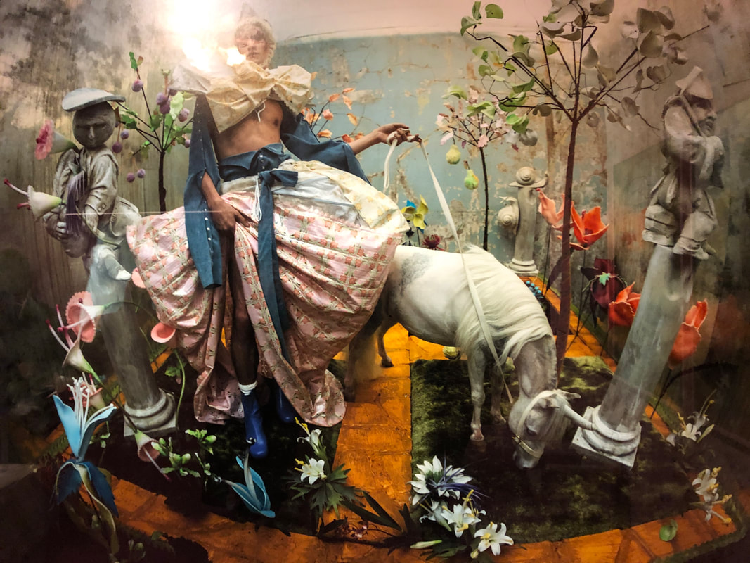
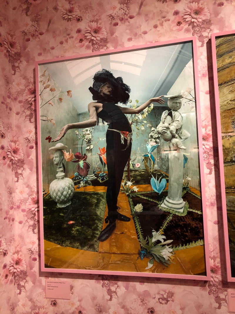
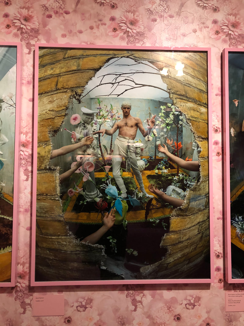
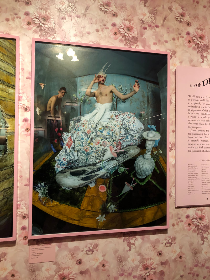
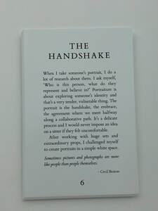 By using softer lighting which creates a haze/fade effect on her images, her images have a distinct gentle style to them. Whilst she does not always work in this style and can sometimes range to creating more serious and dramatic portraits, I am intrigued by the softer style. I support the concept that men do not always have to seem tough, serious and big. Instead, with the use of softer lighting, filters and poses, a man can seem just as powerful but showing through their more gentle and smoother side also. I also love how she photographs men in colour, rather than black and white, as this helps to set something other than a serious mood to the image. Seeing softer colours can often help give an insight into personality and set the mood of an image. I have taken inspiration from her images with male subjects and I aim to incorporate this style in my own photography. Tim Walker The majority of my inspiration for this style of shoot comes from Tim Walker. While in London, I visited The Victoria and Albert Museum which was holding the Tim Walker exhibition. This exhibition consisted of a path that leads you to many rooms exhibiting Tim Walkers work. Every room was completely different and decorated in a style which matched the theme of the images displayed. The first room was painted bright white with a look of white paint dripping from the ceiling. The room was brightly lit which linked to the majority of the background in the images displayed, which were bright white. The series of images which caught my eye in this room were called "THE HANDSHAKE". Walker explains that portraiture is a tool which explores ones identity, which he explains can be a very vulnerable thing. He mentions about never wanting his sitter to feel uncomfortable, so he strips back on his big sets of unique props and instead uses a simple white set up. He thinks of the portrait as a handshake, like a initial meeting. The series of portraits here are for the most part, very simple in terms of set up. I admired the way he stripped back on the style he is used to and famous for and created images which are much more raw and fresh in order to gain a deeper connection with the subject. I have taken influence from this simple set up for my own work. One of my favourite things about Walkers work is that he photographs people who may not be society's standard of beautiful, and photographs them in a beautiful way. He also uses strange poses and angles in his portraiture which helps to explore what beauty is. Throughout this exhibition, Walker had photographed many male models unconventional way, which I think is one of the ways his work is original and unique. Using softer and what is seen as feminine colours, Walker created extravagant scenes in his portraits. He often used delicate objects such as flowers, plants and sculptures to help emphasise the concept of beauty and art. I am greatly inspired by Walkers work and I plan to use aspects of his style/linking props to theme in my own work. I will be working on a much smaller scale project in terms of budget, availability, time scale and physical scale. However, seeing Walkers work has taught me ways I can photograph a male model and how to compliment their appearance.
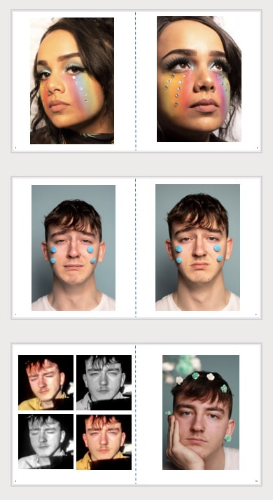
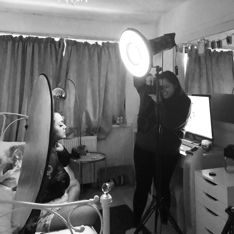
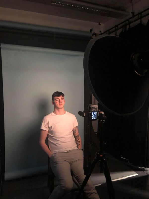
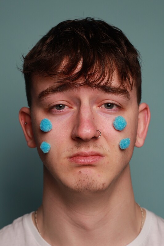
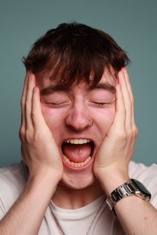
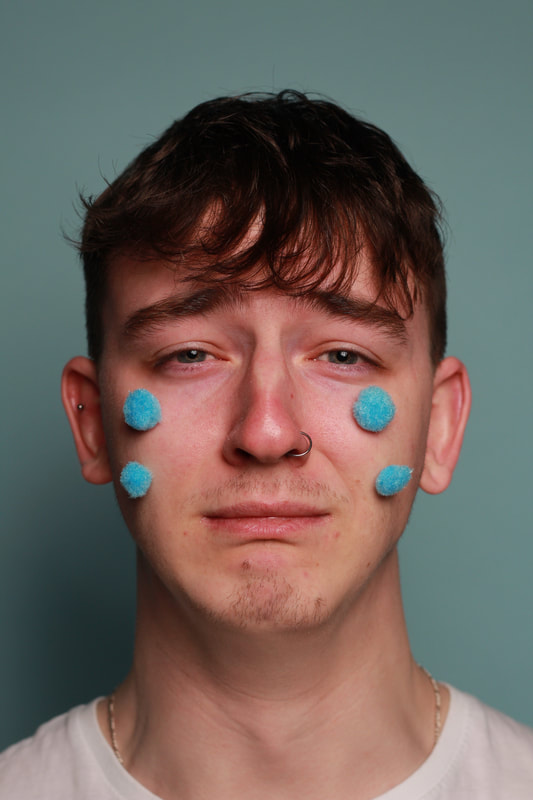
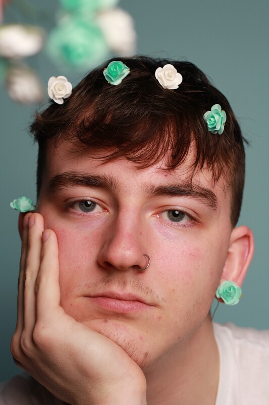
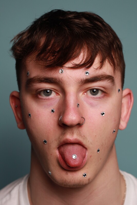
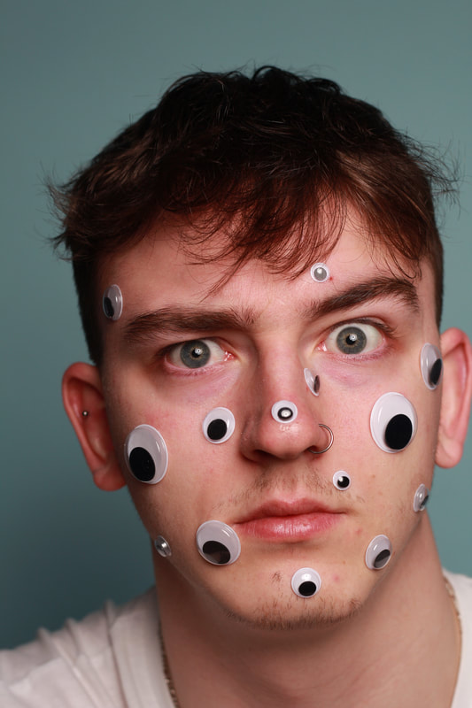
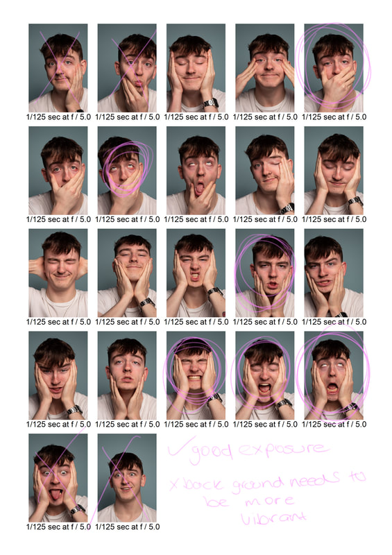
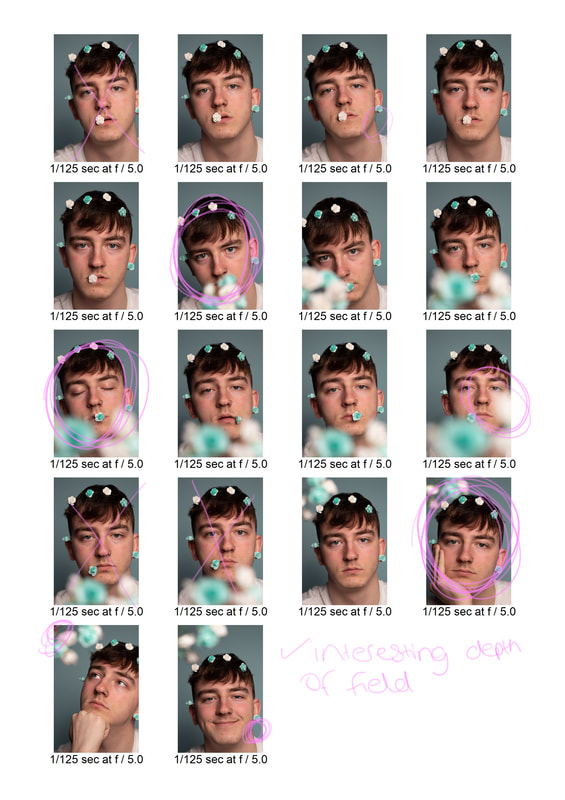
TEST SHOOT 1Using my research about male portraiture both dramatic styles, and a softer style, I went into the studio with a male subject to test it out. I did have to use some of my research about female beauty portriats for this shoot as this style is not often seen with men. I could not find an exact example of what I wanted to recreate as it was often seen with women, or not as dramatic with men, so I did have to use my own imagination. The prep For this shoot, I wanted to take portraits with both makeup/props and without. This was so I could compare the results, and the mood they create. Prior to my shoot, I went to craft stores to get some props. I tried to be as open minded as possible while in the store to get the maximum range of items that I could use. I had to take into account what my model looked like and get props accordingly. My model has blue/grey eyes so I got things which would match well. I bought a bulk of items which I could use for future shoots, as well as my female beauty images idea. Equipment As this was my first test shoot, I thought it would be best to shoot digitally. Along with my props, all the items I needed/used were as follows:
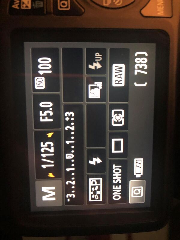
Costs Some costs which I had to take into account were the costs for the props that I bought. I tried to use as much as I could as what I already had, and I went to cheaper places like The Works to buy materials. I did not have to think about travel costs as I was driving my and my model to the studio at college, which I would have been travelling to on that day anyway. In total, everything came to about £6, which was perfectly affordable. The set up I planned to have a very simple beauty style set up in the studio, only using one or two light sources. I had a beauty dish light source with a diffuser on it directly in front of my model. This lighting would be bright enough to fully illuminate my model, but also provide soft, flattering lighting with the aid of the diffuser. I then used a tripod, also directly in front of my model to get face on shots. The use of a tripod was to keep the camera in the perfect position while I make any adjustments to my model. My model was sat on a chair in front of a blue backdrop which I had previously chosen. Having my model sat down would keep them in place better, and ensure they were more comfortable. After playing around with the power on the light source, and the settings on my camera, I found the perfect setting were a shutter speed of 1/125, aperture f5.0 and ISO 100. These settings would ensure I had a perfect exposure, while also getting a nice depth of field in my images where the subjects face will be in focus, and the background begins to blur. I had triggers in my camera and my light source. As you can see in the image of my lighting set up, both camera and light source were directly in front of my model to create minimal shadows and face on shots.
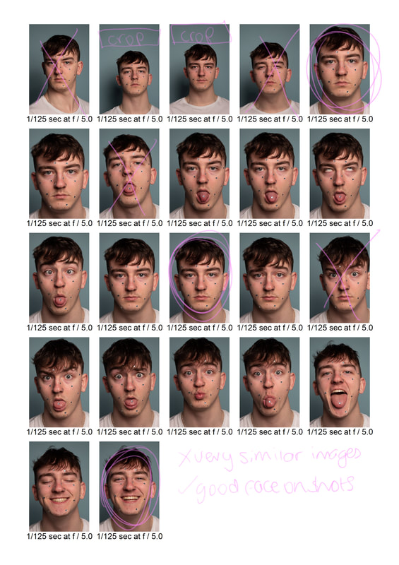
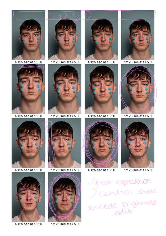
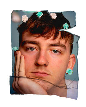
This shoot took about an hour and a half as I made a few changes with my models looks. I began by taking normal shots of my model which I plan to convert to black and white to create a Richard Avedon style. I then got my model to silly faces, using his hands to tug at his skin to change the way he looks. In portraits, the subject is often looking very serious and pokerfaced, I wanted to challenge this by getting my model to make faces which you do not usually see in portraits. I then continued to use props which you do not usually see in male portraiture to make the shoot more fun and unusual. I had a wide variety of images that I could use for a final series and I am very happy with the results I achieved. The images have enough going on in them individually to work on their own, but as a series, I feel as though it portrays a clearer message about the stereotypes of male beauty standards. Here, I edited the images with filters on Instagram. This filter intensified the saturation, and brought out the blue in the images. It also added colour back to the subject skin.
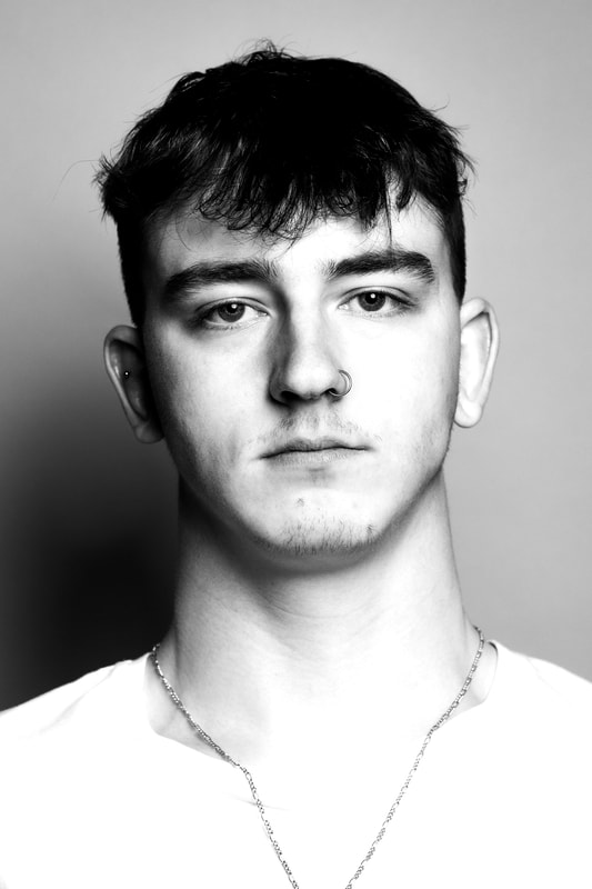
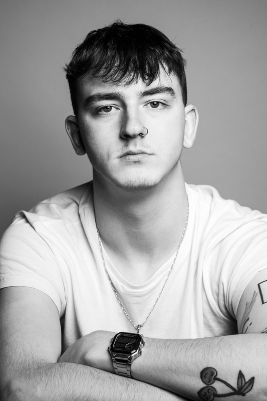
I then edited the more serious images of my subject in a David Bailey style with high contrast black and white filters. This is the typical way that a male model is told to pose/how the images are edited. I did not create a stark white background as Bailey does as I preferred the images without it. Here there is a dramatic contrast to the my images in colour, and the images in black and white. Obviously, the facial expression/pose is one of the main differences. Instead of being silly and playful, my model is very serious, the way I see men usually pose in photographs. The black and white filter also brings the mood of the image down by making it more mysterious and calmer. These type of portriats could be used for advertising or character portraits/portfolio.
I find it interesting how I have used the same model, wearing the exact same things in the images, but just the face expression and filters can completely change the meaning of the image and what its purpose is. I prefer the look of the colour images as they break the male beauty stereotypes and show that men do not always have to put on a serious front, which most photographers do not acknowledge. Polaroid LiftAfter editing these images with a generic filter and retouch, the colour and style of them reminded me of a polaroid style. Therefore, I used one of the images to try a digital polariod lift. To create the polaroid lift with the image, I followed a tutorial which my tutor has created on Photoshop. There was no quick way of doing this, you had to be very precise while using the liquify tool in order to get the authentic polariod lift look.
|