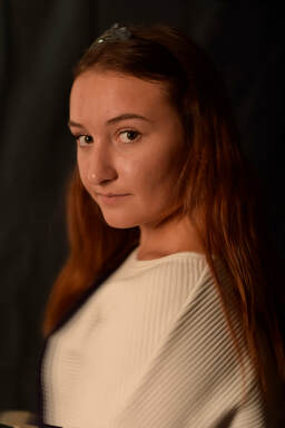
 A petzval effect is a slight movement/blur on your image while the eyes are in focus. It is where there is a shallow depth of field, with a sharp focus. It is mainly used for portraiture as that is where it works best.
Firstly, I duplicated the layer. Using command T, I moved the anchor to the middle of the models face. I then changed W: 101.00%. using command, alt, shift, T, I pressed these 4 times to create 4 copied layers. I then selected all of the layers to have an opacity between 30-50%. To then join all of the layers, I pressed command G. After, I added a layer mask to the group of layers. Ensuring the paintbrush tool is set to black, I used this to paint any areas which I wanted to come back into focus, like the eyes/facial features. I really liked the way that this turned out as it created a subtle distorted effect. I would use this again in my portrait images to just add a different look to them.
0 Comments
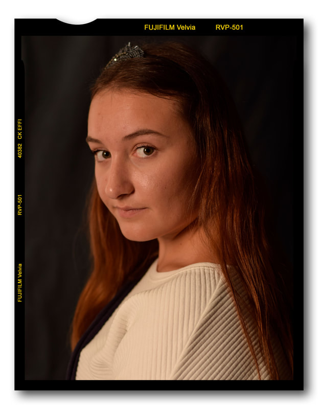
All of these borders were very easy to do. To do them, you copy and paste the borders onto your photo, and adjust it to size accordingly. This is very useful as you can put any image into the border and it will create an interesting effect. There are different styles of border and you can even get a view finder look.
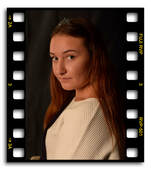
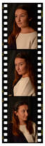
An interesting way to create a series would be to use the 35mm strip and put some of your images in.
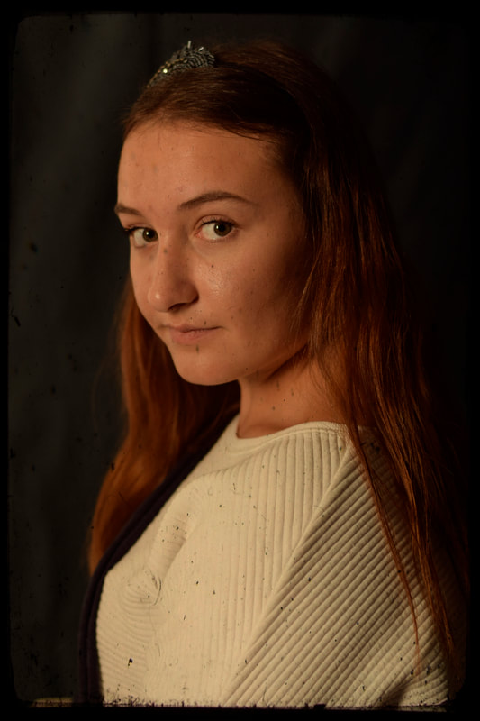
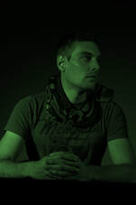
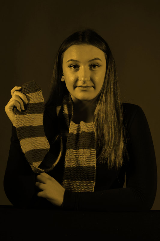
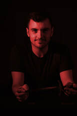
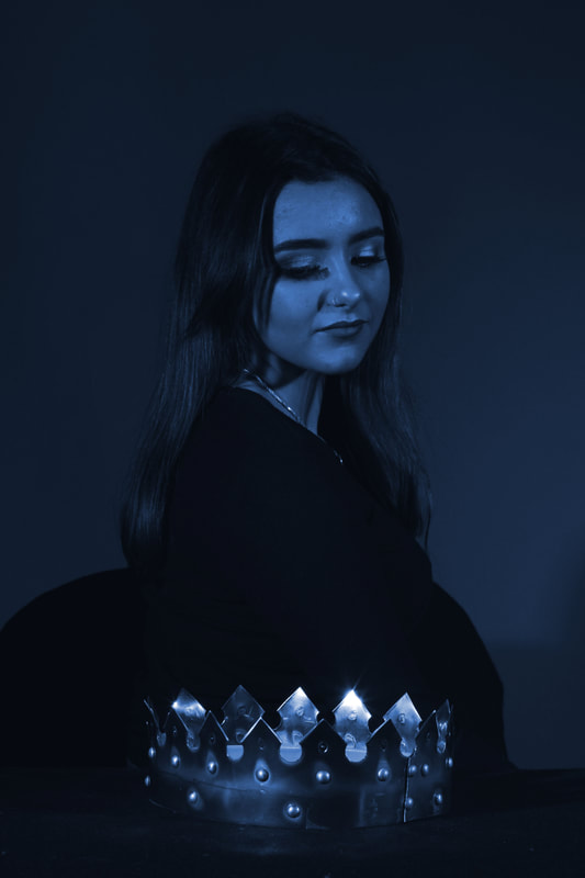
Another thing that I enjoyed doing during the project was digital toning. What interested me about this was the endless possibilities that you could create. You could entirely change the mood of your image by just adding a colour to it. As I used coloured gels in my shoot, I thought it would be interesting to see what my images looked like if they were solidly the colour of the colour gel. I wanted to see if this helped change the mood, or link to the house better.
This was a very quick edit that I did on Photoshop to test out toning and to see if I liked the look of it. Although it is not perfect and does require some further editing and adjustments, I love the way that this looks. This works very well if I was going to create a poster for a Harry Potter movie, or even advertising products. This process was extremely quick and simple and the effects are brilliant. I had not initially planned to use toning in my final series, but now after testing it out like this, I am definitely going to test out more and consider it. I believe it helps to categorise each portrait into the intended Hogwarts house perfectly. The strong use of colour also helps to give an insight into the personality of the house, which is very useful. |
About me
I am currently undergoing a Creative Arts & Design Practise (Top-Up) course. This blog contains tutorials and advice when creating digital images and editing using Photoshop. Archives
April 2021
Categories |
 RSS Feed
