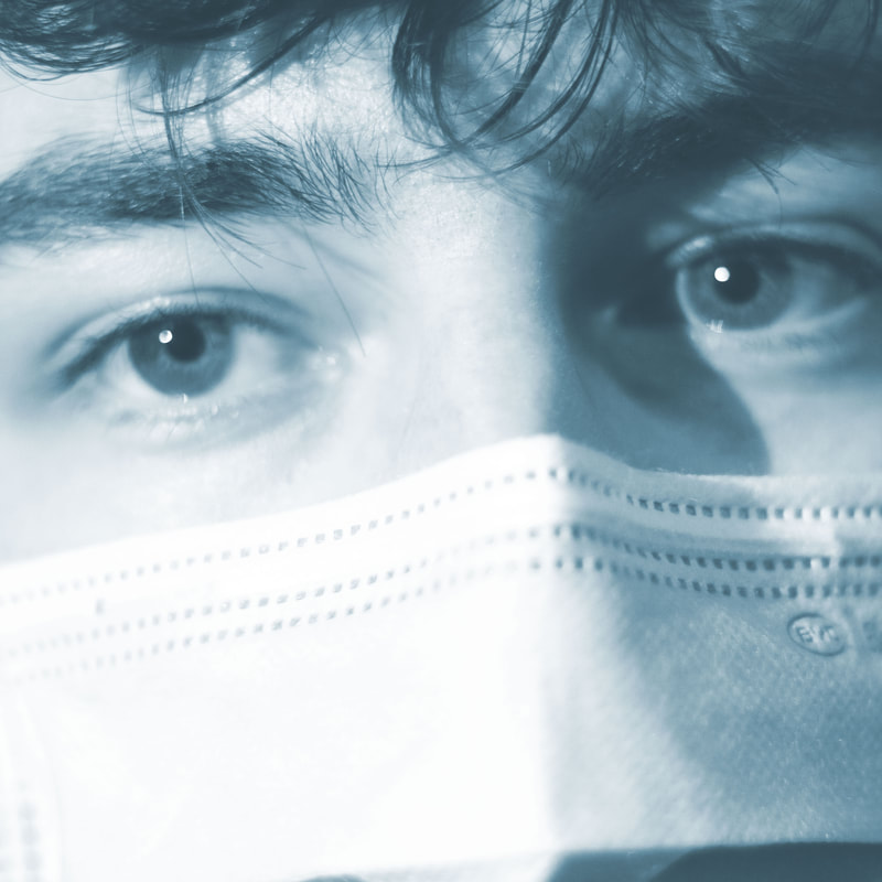
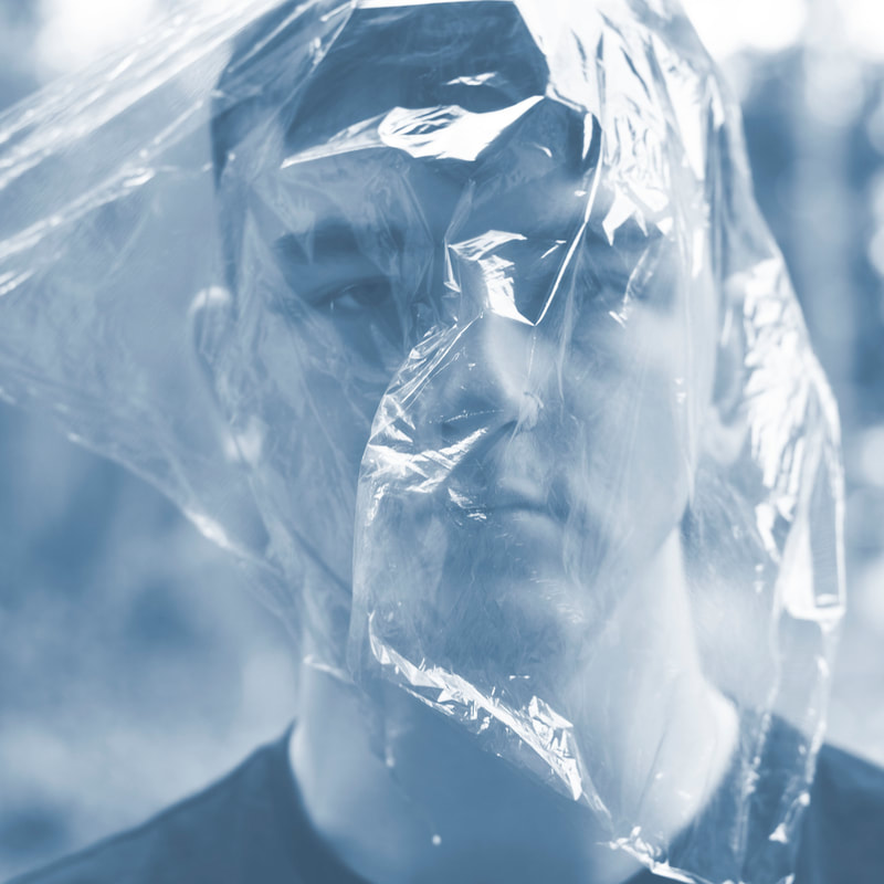
Last year, I discussed how digital toning was something that I loved to use as it completely changed the mood and style of an image, and it is incredibly simple to do. This year, I have adapted to the style of using digital toning to help to portray a message again. In my recent work, I have been exploring the repercussions of COVID-19, and how people are feeling. Using props, I was able to signify the link to COVID-19 using masks and cling film. Both of these items represent the need for being covered and protected, but wanting to break free from them.
I used a light blue shade tone in my editing process for multiple reasons: - Blue represents sadness, but also trust (I wanted to create an honest/relatable portrait) - The shade of blue links to the NHS (gloves, scrubs and masks), a further visual link to COVID-19 - The lightness of the blue gives a "barely there" look, which comes across as calming to see, which works in contrast to the strong message. I plan to continue to tone my images digitally as they help your images to be perceived the way that you intended them to. This is helping me towards recognising my style in my practice.
0 Comments
Leave a Reply. |
About me
I am currently undergoing a Creative Arts & Design Practise (Top-Up) course. This blog contains tutorials and advice when creating digital images and editing using Photoshop. Archives
April 2021
Categories |

 RSS Feed
